
Right now in my circle of friends and in my client meetings there is something that has been coming up more and more often. For those of us looking forward to months of winter there seems to be something on our mind: winter gloominess. Llately I’ve been asked a few times if doing something different to our homes can help offer some relief to the dark and gray of winter and the way it can make a person feel, which is: not good. (And the answer is a solid ‘hell yes!’)

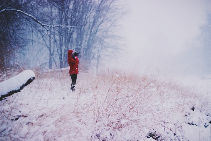
Seasonal Affective Disorder is a sub-type of depression that burdens a whole lot of people who face long, dark, cold winters every year and the further a person lives from the equator the more prevalent it becomes.
In simple terms, here’s what happens:
Sunlight = serotonin = happy
Darkness = melatonin = sleepy and hungry
Shortened days + daylight saving adjustment = circadian rhythm thrown off = hormone production thrown off
What does SAD look like?
Symptoms can be ‘not fun’ and many people find they are just generally feeling ‘blah’ without really putting a finger on what exactly could be going on. I’m (obviously) not a medical professional (pause for laughter) but if you are feeling any of these symptoms creeping into your life, maybe give some thought to Seasonal Affective Disorder.
Unusual sleep patterns
Extra hungry, especially for carbs
Weight gain
Lethargy
Withdrawal, craving solitude, general disinterest in regular life
Nervous, anxious, unable to concentrate
Taking action
So, the good news is that for a lot of people doing some small things can help in a major way (we’ll get to the one I know the most about in a minute because I’m an interior designer and not a doctor). Get your google on with these common suggestions:
Light – sunlight or artificial light therapy
Exercising outdoors – exercise, fresh air and sunlight
See a professional – therapy in many forms can help, from acupuncture to talk therapy
Here’s where I come in
This is all so prevalent here that I take it quite seriously in my design work. I always mention low light and the blue tone that bounces off the snow outside when clients and I are talking about paint colors. It’s my duty. I think I took an oath about this once.
Statistics say that at least one member of every house where I am designing will suffer from Seasonal Affective Disorder, not to mention it just plain feels better to have a home that feels warm, happy and cozy. It’s a long, long winter, man. If you don’t live this far north, in the vast prairies especially, you might not feel the same, but winters can be brutally hard on the psyche. We have to stand up and fight back. In a cheerful way. Let’s have a group hug and sing O Canada.
So, what about the psychology of color? What should you be thinking about when you are choosing wall colors for your frozen northern homestead? Here are 3 things I try to cover when helping my clients.

The light that bounces off of snow is very blue. In the depth of winter here it starts to get dark in late afternoon (4pm) and it stays dark until after breakfast the next day (8:30am). (Let us have a moment of silence for those that live in that year after year.) Imagine a very pale blue or grey transparency sheet over every swatch of paint you are looking at. Be kind to yourself and go a touch warmer than you are first considering. You can still maintain clear, crisp colors without looking muddy or yellowed if you just go a touch warmer. Hold3 similar shades in a row and you will see clearly which one looks warmer (more yellow, red, or orange).

If you love a very pale color, consider going just one shade darker. The richness will compensate for that pale light that comes through when it’s overcast yet still hold its color when the glaring sun is bouncing off the ice outside on the clear days. So many people fall in love with that ‘just perfect’ shade of barely-there color only to be sadly disappointed when they paint their room and it looks washed out to a muddy white or grey.

Your home is an extension of the people that live there. It is not the post office or a sad college dorm. Live it up a little; go all in with something you love. You can boldly use a color that makes you feel good and you can do it in a way that makes you and your family happy, without going overboard. If you love hot pink, paint one wall in your powder room. A block of bright pear green in the mudroom can look great. The wall behind your king-sized headboard can be the boldest turquoise. It is only paint and even if you never want to change the color itself, you are going to repaint eventually anyway. Consider a crazy color a short term investment – be smart about where you use it and know that when the time comes it’s going to cost you $50 and take an afternoon to erase it and go in a whole new direction. Totally worth it!
I hope that this has given you some helpful ideas for having a better winter in your home! Here's to a cozy feeling inside when it's freezing and grey outside!
Ready to love where you live?
Join 25 000 others for instant access to my library of free, practical, and down-to-earth interior design resources!