Brick and Paint Combinations: Earthy Exterior Pairings That Work

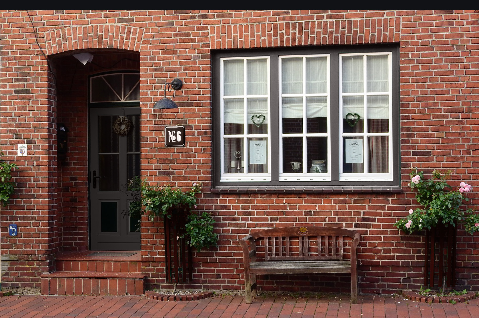
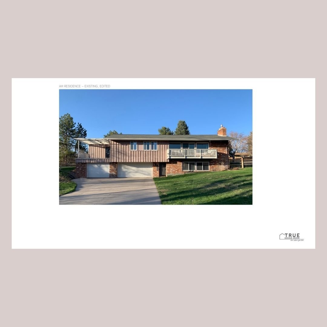
One of the most classic exterior materials can be the hardest to design around – the varied colors and textures in the natural brick can make it complicated to find an obvious paint color pairing.  The good news is that brick exteriors can be beautifully freshened up and brought to life again with the right paint combination.  

Keep reading to get inspired and find some ideas for the perfect paint color to make your brick exterior shine.


I help my clients with redesigning both interiors and exteriors and in that mix I’ve been able to help with so many brick exteriors over the years.  They are often my favorite transformations!

Here’s what I’ve learned after completing nearly 100 brick-focused exterior design projects:


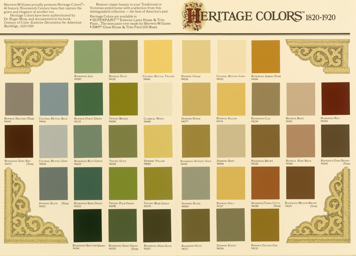
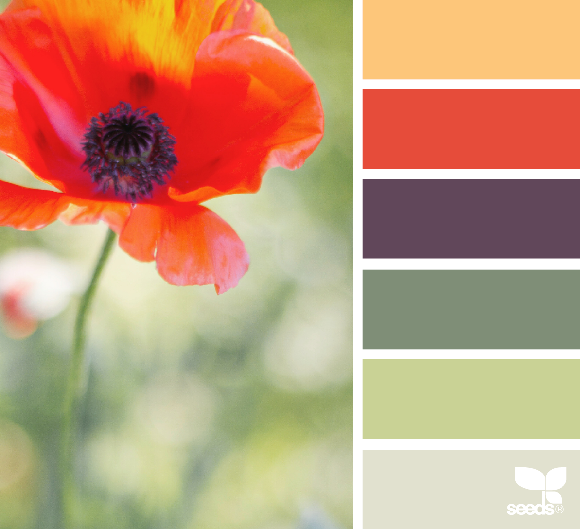
Brick is made up of many colors & shades

This might seem obvious, but brick is a material that is not only full of different colors, but because of aging and exposure to elements, each color can have many shades within it.  Once you layer in the texture of the brick and mortar itself, well, it’s a lot to try to simplify into one color. 

Though this can be a challenge, the advantage to this is that there are many colors that can be picked from, paired with, highlighted, brought out, enhanced, or toned down.  You have options!


Tip:  try to find one color in the brick that you want to work with and enhance.  If we do our job finding a nice paint pairing, this is the color that the brick will ‘read’ as from afar.

All of the colors shown here are found in this brick sample!


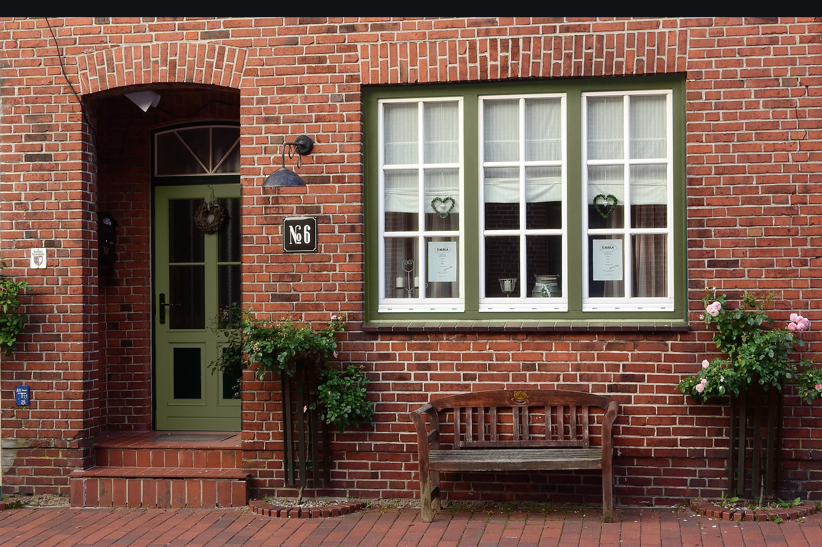
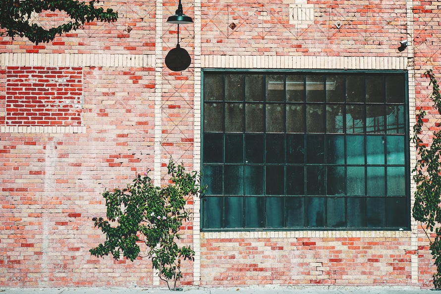
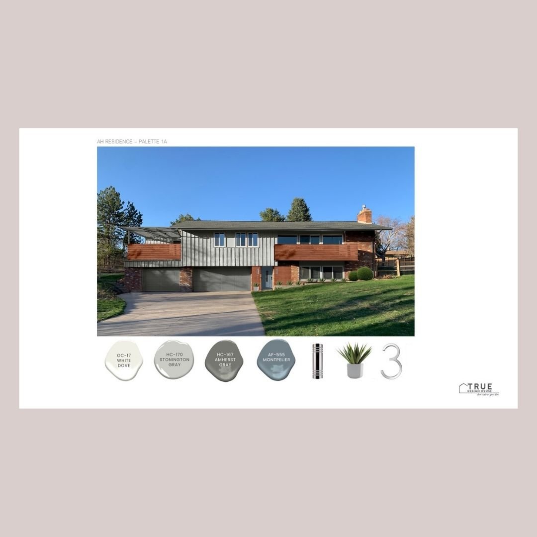
Natural brick pairs best with rich, earthy colors

The warm tones of brick are a match made in heaven for paint colors that have rich undertones.  You can choose a warm or cool color, in my experience, and as long as the undertones are muddy, it will work well. 

I tend to prefer cool pairings to act as a contrast to the brick, but if a warm color that creates a cohesive look with the warm brick is more your style, that can work as well.

You don’t have to use all neutral paint colors, either - just keep the ‘red / orange / yellow’ of the brick in mind as a color already in your palette.


Tip:  look for shades of a color that are ‘grayish’ or ‘brownish’ to get that earthy look.  Try to play with combinations focusing on one main brick color that you want to bring out.

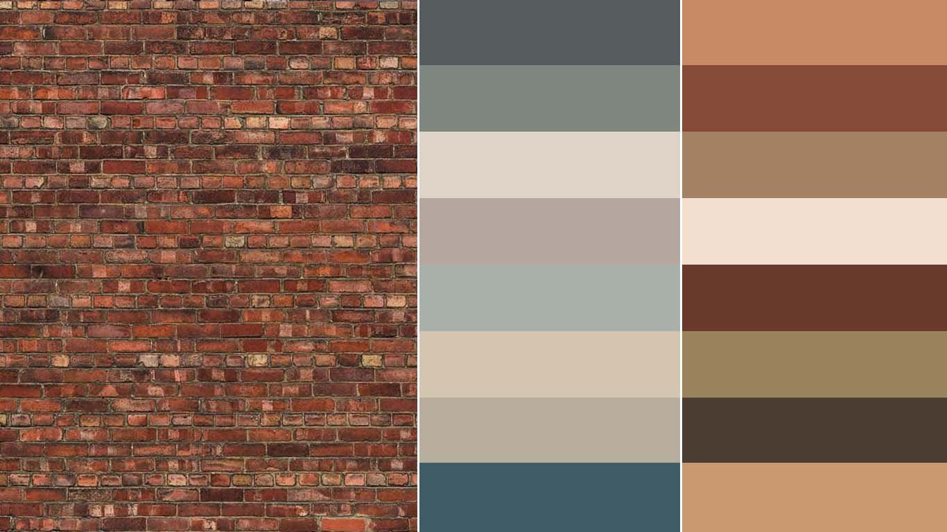
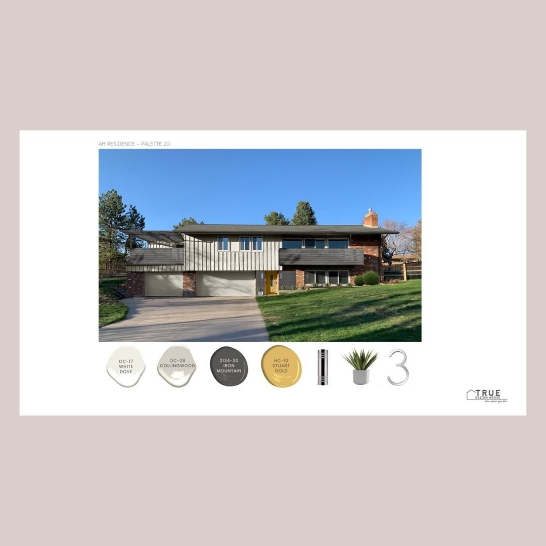
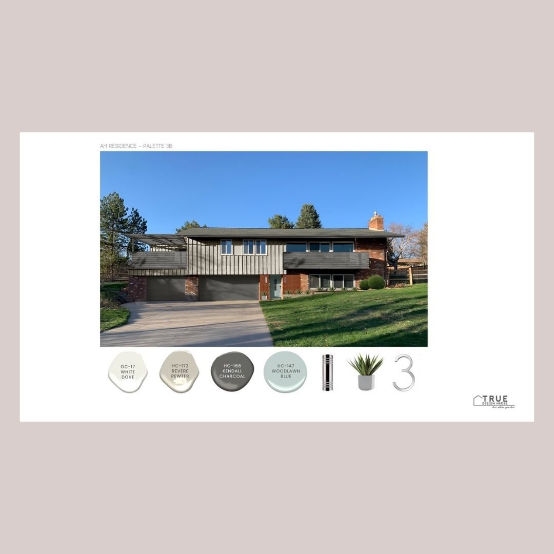
Here I chose a paint color pairing for each of the brick colors found in the sample. Any one of these would look great with the brick as it pairs well with one of the subtle colors in the brick.


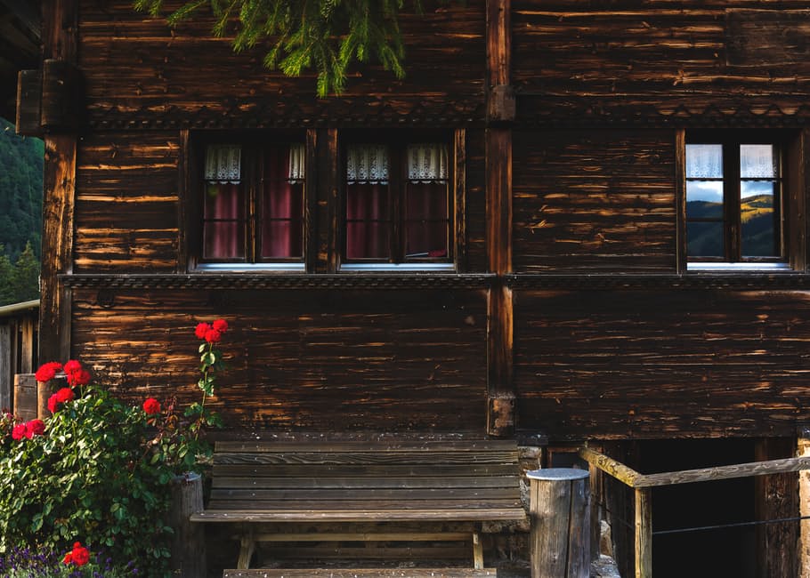
Brick adds enough texture to the exterior façade

The patina, richness and texture of brick add so much life to a home’s exterior.  Natural materials add variety and complexity to otherwise flat and monolithic surfaces. 

This gives you a built-in advantage:  you can simplify the textures, patterns, and decorating details of your exterior and still have a visually interesting house.  If you give the brick some breathing room, it tends to create a natural focal point for the façade of the house without needing many extra details added.


Tip:  brick tends to look best with more simple details surrounding it.  This could mean streamlining details like landscaping (1 shrub type repeated in rows or groupings rather than 5 different kinds scattered throughout), edging (clean simple lines in an understated material), décor (consider removing things like garden décor, signs, colorful and varied porch styling, etc. and instead having a few simple planters or porch chairs).


Below, see 5 paint combinations that work well with red brick.

There are lots of options for whatever you want to paint whether it’s the siding, front door, window trim, roof line & gutters, mailboxes or the deck! 


Classic Colors for a Front Door

Looking to repaint your front door with the most inviting classic colors for 2021?   This collection of 7 Benjamin Moore paints is perfect for the job and scores extra points with red brick houses, dark wood houses, or any dark brown stucco or siding colors.

No color family is more serene, deep and classic than rich, warm autumn colors.  If you’re looking for an easy refresh for your front porch, I’m happy to share a collection of my favorite front door paint colors today.

These colors will work with lots of different house colors and materials, but especially those in the dark, warm color family – dark wood, deep brown stuccos & sidings and classic red brick.

Special note for brick houses: Red brick houses look best with a rich door color, either light or dark,  but something with lots of saturation.  These door colors will hold their own against the rich red brick color and the strong pattern of brick walls.


Watch the video below to see my collection of the 7 most inviting classic front door colors!


While you’re painting the front door, don’t overlook some other simple updates that have big impact – I’ve created a list of the best doorbells, knobs, knockers, house numbers, planters and porch lights for your 2021 front door update!


This post contains affiliate links. For more information please click on the 'policies' tab at the bottom of this page.


Download this graphic, including all the paint names & codes in the Resource Library!


Want to Pin to save for later?

Here you go!

Quick and Simple Curb Appeal Basics– A Crash Course from an Interior Designer


 The goal with curb appeal is to make your property appealing and memorable.  This applies whether you are getting ready to sell your home or you just want to have a front facade you are proud to have your family and friends pull up to.   As you work, keep those 2 words in mind:  appealing & memorable.  Let’s get started!

There are 3 main steps I think about when working with clients on their exterior facade and I’m going to walk you through them and explain a bit of theory as we go.  At the end, I have a checklist of tips for you to print and go through as you are getting things done.  For the most part, this is an afternoon project.  If you need to do some repair work or go shopping, it might add on some time, but far and away, most of my clients can get this done quickly with a little bit of physical labour and by using what they have around the house already.


1.       Prep:

This is the time to clean & clear as much as you can – give yourself a blank slate to work with. 

This step makes the most difference when you are preparing to sell your home.  You might be able to see past a lot of these things, but potential buyers normally can’t.  Where you see ‘I need to get out and rake those leaves this weekend’ your buyer sees ‘wow, there is way too much yardwork to keep up with here, no thanks’.  It’s so subconscious, and I’m sure they are very nice people but those little things add up very quickly to buyers, often without them even realizing it.  The more you can do to keep that subconscious to-do list short, the better! 

If you are just working on curb appeal for your own happiness, it is also important to start with this step.  Much like decluttering inside your home, it will be easier for you to enjoy your yard and be proud of your home without a bunch of little annoyances in sight.


pexels-photo-29410.jpg

2.       Create the feeling of an appealing lifestyle:

So much of the power of curb appeal lies in helping people see the lovely parts of the life that you have in your home.  This is the good feeling people have when walking up to your front door.  It’s a feeling that makes your visitors want to sit with you on the porch and put their feet up.  It makes potential buyers want to have coffee in the morning looking out on that yard.  You need to create a vignette, make a case or create a good vibe, whatever you want to call it. 

The appeal almost universally lies in conveying a relaxed, orderly, safe, calm lifestyle.  This is achieved by creating an outdoor seating area (even a small stool suggests this), having flowers or foliage around the front door, having a great door mat and clear house numbers and even things like thoughtful lighting.  You want people to walk up to your front door and exhale ‘ahhhh, this is so nice.’

If you are selling your home, you can also add some staging to the front area.  What is the lifestyle appeal of your home or area and is there anything that gives a subtle nod to it?  If you live near a lake, a fishing rod leaning in the corner is great.  If a park is within walking distance for kids, a nice basket with some outdoor balls in it or a baseball bat & mitts does the trick.   If you have a nice porch that is great for having morning coffee on, leave a book and clean coffee mug on the side table of your porch seating area.  These are all small touches but they can be very powerful subconscious messages to potential buyers about the appealing lifestyle you have in that home.


3.       Make your home memorable:

Here is where you add the icing on the cake.  This last step is a powerhouse if you are preparing to sell your home, but it’s also that next level up if you just want to love pulling up to your own home that little extra bit.

Why is this important?  Buyers aren’t just looking at one house, they are scanning online listings, looking at flyers, and generally absorbing a barrage of details about a lot of homes.  They are doing this for weeks or months sometimes.  After awhile those houses can start to melt into one another.  It’s a funny thing, but the smallest detail about your home that sticks in someone’s mind means that your home is at the top of the list in their brain, along with all the relevant details about your home.  Familiarity is comforting and when someone is faced with a huge life change like moving, the more they think about your house, the more comfortable they feel with it and the more comfortable they feel with it, the more they are going to gravitate toward living in it.  This is great news when you want to sell it, right?

If you’re not selling, this same factor is what helps your friends and family feel comfortable in your home.  It also means that because you are putting that extra bit of your own personality into your space, you are going to be extra happy there as well.  There is no downside to this!

What makes a home memorable?  Mainly, it comes down to this:  one or two things that are bigger, bolder and more colorful than their surroundings.  You need a statement.  Something unique.  Something in a bright color or interesting material.   Something that makes people say ‘oh, the house with the _____?!  I know that house!’

Does it need to be a purple cow statue on the front lawn or a toilet bowl planter full of foliage?  Um, no.   Those might be conversation starters, but I’m not sure that’s the vibe you want your home to be giving off (or maybe it is, I don’t judge.)  There are lots of great ideas that will also enhance the style of your home.  Consider a few nice planters overflowing with bright flowers near the door, a unique color painted on the front door, house numbers painted a bold color, a door mat with some style, a really great light fixture at the door, or maybe just one bold colored accessory on the porch.


A checklist for my people getting ready to list their house:

I know how overwhelmed and busy you can feel if you are getting ready to sell your home, so I’ve created a checklist for you to print off and work through.  It can really help to calm that mental chaos if you can just work through something step by step.  It's ready and waiting for instant download in my free Design Resource Library -  check out that link below to have it instantly emailed to you.


My advice for getting this done? 

1. Print the checklist from my resource library. 

2. Do a 15 minute walk around and see if you need to buy anything (cleaning supplies, paint, whatever) and make a list. 

3. Gather what you need and get it in one spot (hoses, ladder, etc). 

4. Set aside 2 -3 hours to improve your curb appeal.  Do what you can and move along.  

5. If you have more time later, keep working on things you didn’t get to, but any improvement is good and nothing is ever going to be perfect!  You can do this!

Ps - Not all of the tips will apply to every home, so just cross off any that don’t apply to you – doesn’t that feel great? 


the home staging lab pg 1j.jpg


Looking to Pin for later?

Here you go!


Ready to love where you live?

Join over 16 000 others for instant access to my library of free, practical, and down-to-earth interior design resources!

Stunning Paint Colors That Will Make Your Brick Exterior Beautiful


Need some design inspiration for your brick exterior? Looking for the best paint colors to go with brick?

Sounds like you’re ready to breathe some new life into the outside of your brick home - good news, you’re in the right place for some very specific advice & paint suggestions.

There are a few basic design theories and practices that take a brick exterior from tired to knockout and I’m going to walk you through them and, don’t worry, I also have a downloadable cheat sheet with a curated collection of 14 Benjamin Moore paint colors that will make your brick exterior beautiful. 

Let’s get started!


1. The 3 Color Rule

A general design rule of thumb is that exteriors look best with a combination of 3 colors. 

This gives a good balance between the main overall background color and some details that can be a bit bolder without overwhelming the house.  For most people, the goal is for it to be cohesive and gorgeous with just a bit of ‘oh, that looks so good!’ wow factor.


Main Color

The main color is what would normally be the central siding or stucco color.  This is sometimes called a field color.  This would be a nice, rich tone that you can live with for a long time or that is neutral enough for resale down the road. 

If this is the brick portion of your house, then this is taken care of!

This color tends to be the biggest financial investment as well, so it makes good sense to go with something that can serve as a nice background for years to come.   

You can dramatically change the look of a good neutral main color by changing up the ‘quick and easy’ accent color in places like the front door or shutters, so choose wisely here.  This is the time to consider the architecture of your home and of your neighborhood and to take a good look at heritage colors.  These tend to be mature colors that have stood the test of time and are not likely to go out of fashion anytime soon.    

You also want to think about whether you want to have your home color be cohesive with the rest of the houses in your neighborhood (mostly, the answer is yes!)  You don’t want to be ‘that family’, right?   Unless you do want to be, then go for it – whatever makes you happy!

Secondary Color (Or Secondary Grouping)

The secondary color is often seen in stonework on the front facade, like field stone, slate or possibly this is the brick we are talking about today.   

The secondary color might also be the trim of the house – fascia, gutters, window trim, railings, etc.  If there is not a lot of stone, I tend to let that sit as a ‘near-neutral’, a ‘secondary-secondary’ color because you kind of do need and want a separate trim color in a lot of cases. 

Some houses will use a paint color for the trim that matches the stone and that can work as a ‘secondary team’ also. 

This grouping of secondary colors should not take up a huge amount of the area of the house facade because you don’t want your stone and trim to compete with the main color of the house but you want to have more of this neutral color than your accent color. 

This color is great to break up the facade of the house visually, highlight architecture (like windows, gables, flower planters and porches), and give some depth or balance to what can sometimes otherwise be a large, flat rectangle.  You wants lots of contrast between the secondary and main colors in most cases.

The Accent Color

A bright, bold or eye-catching color might be perfect for the front door but would be a bit crazy on the entire house, which is where that third color, the accent color, comes in. 

This is the place to go a bit bolder and choose something that will make a statement if you like.  It can also be the place to, finally, show some personality in the exterior colors or to just use color to evoke some feeling. 

The accent color doesn’t need to be a bright red door that announces your style to everyone who passes by, it can also be a deep charcoal paint on the shutters or a soft butter yellow on the porch floor.  This is the place to create some style.


 2. Perfect Ratio

There is a design theory of the perfect ratio for these 3 colors:  60:30:10.  This provides the main color, a secondary color and an accent color.  Use this ratio, it is your friend!

To use this information with a brick exterior, you need to use the brick as one of your three colors.  Depending on the amount of brick, this will likely be the main or secondary color.


3. Your brick tone

You also need to take your own brick’s tone into consideration before starting to look at other colors.  There are likely variations in the colors on the entire area, as well as within each brick, but the overall brick can be red, coral, orange, pale peach, grey, or even purple toned. 

Taking a digital picture and looking at it from far away can help figure this out if it’s not obvious right away.  It can also help to have a photo when looking at colors. 

Make sure to hold your samples up to your brick and take pictures of the whole grouping together to get a different perspective of how the colors will look together.


 4. Architectural details

Consider the color of other architectural features.  If they are permanent or you just don’t want to change them right now, they need to work well with the colors you are choosing for the facade.  Look objectively at these areas:  the roof, window trim & mullions, railings, stucco, vinyl siding, flower bed or planter building material. 

Some of these things you might want to paint your main or secondary color, but some are just going to soldier on as-is, so you are going to have to work with them.  You should always be able to work around things that can’t be changed and it’s sometimes surprising just how different things can look with the right paint colors around them... so, yes, there’s even aesthetic hope for that ugly roof you’re saving up to replace!


 5. Landscape flow

Landscaping plays an important role as well.  The colors of dominant shrubs, flowers, planters, and trees near the front of the house should also be looked at objectively. 

If you have, especially, some mass plantings of bold colored flowers along the house front, you are going to want to ensure that either your paint enhances or harmonizes with these or that you are willing to transplant them elsewhere and replant something that will be gorgeous with the colors you have chosen.


I’ve created a little Brick & Paint package for you!

It includes:

  • a set of 14 Benjamin Moore paint colors that pair well with brick

  • a paint finder tool to screenshot and take to the paint store with you

  • a graphic summary of the tips outlined in this article. 

 
True Design House - brick paint mini houses 2.png
 

Wait! Do you need more specific help?

Slide2 - sm.png

Did you know you can hire me to help you choose your exterior paint colors and paint them right onto your house?

2.png
8.png
5.png


Looking to Pin for later?

Here you go!

true design house - brick - 30 - pinterest - 4.png


Why Change is the Key to Happiness


My clients often teach me just as much as I teach them when we work together.  This is a lesson from a few clients I've been working with lately:  take the leap.  Make a change, even when you're not exactly sure what to do, even when you're uncertain.  Knowing that what you are living with just isn't right, that's enough reason to just begin.  Go ahead,  add some happiness to your home!

Change is hard, isn’t it?  Even when we sort of know we could change things in our life, even if we know just what to do to make things better, we just... don’t.    I think it’s that we all crave comfort and that can mean staying the same place long after something stops serving us, stops making us feel our best.  Thinking outside the box, making a leap, making a statement to the universe that you are willing to do something new is a powerful thing for your psyche.   Often, making a small change in our lives or our home becomes that first drop that causes that ripple effect, don’t you find?  If we can just have the courage to make one bold change, it feels so good and we have no problem finding that momentum to continue finding things to fine tune.

Comfort, predictability, stability – these are all things we love when you think about it, but they can be a huge source of unhappiness for a lot of people.  How is it that the need to feel comfortable can keep a person tied to things in their life that are sources of discomfort?  If you are living with something in your home that’s not uplifting you, it might be time to just take the plunge and make a change.

I see this often in my work, where a client has lived with something they hate in their home and they know they want a change, they often have a great plan for just what to do, but they need some reassurance that what they want to change is going to be great.  Basically, they need someone to push them out of the plane!  Ideally, before doing that, this person can also help hash out a solid plan for going forward and be able to work through every question and doubt, providing examples and information, until they feel certain and excited about the plan! 

pexels-photo-large.jpg

In all reality, fighting change is a losing battle.  Happiness is found in flexibility.  Yes, it can be uncomfortable to change, but it is worth it.  This is the natural course of life, to put something to rest to make room for something new.   Yes, it’s unknown and can feel like maybe it will be chaotic or not work at all, or maybe be worse than before, but it doesn’t have to be that way.  The reward is worth  the risk.  I think being able to think out a good plan and take action on it is often something that just has to be tackled without putting much weight on your feelings about the changes.  It’s going to be great!  Focus on the framework of what you want to change, the ‘why’s and put some time and thought into your plan.  That is the structure of what you need to do.

Add some happiness to your home.  Happiness is anything that you love, that makes you smile, that makes you feel good when you pass by it or exist with it.  Organizing your Tupperware drawer, rearranging your bedroom furniture, printing and framing some beautiful photos from a great vacation you took, even just streamlining your mudroom.  All of these bring joy to your life and like ripples in water,  that spreads.  Trust me,  being happy in your home matters. 

There are bigger things, yes.  Paint a wall or a room.  Paint your front door.  Buy a new chair.  Your home is worth these things.  Start to think of your home from the perspective of upping your happiness.  Choose things that make you smile. 

Ready for even bigger? Tackle that kitchen renovation.  Revamp the exterior of your home.  Finally put in that patio in the backyard.  Go for it.  Your dreams and enthusiasm and ideas are valuable.  

A lot of people do things like this, they feel the need to make a change, they plan it out and they go for it – why not you?


Ready to love where you live?

Join 25 000 others for instant access to my library of free, practical, and down-to-earth interior design resources!

Looking to Pin for Later?

Here you go!

true design house - change - 23 - pinterest - 4.png