Should You Be Painting Your Cabinets White?

This week brought this fabulous question to my email inbox!

Hi Tara,

We live in a bi-level with the old style kitchen and separate dining room. We want to knock out a wall and make a larger kitchen and eliminate the dining room. We are having a tough time deciding between white or dark cabinets (current ones are honey oak). Are either timeless? Also, we want to add some built in cabinets in the living room, should they be the same color as the kitchen cabinets?


Hi there!

So, this is a very common question with a very complex answer and I’m so glad you asked it!  The answer requires a bit of a design thinking in a few other areas:  balance and details.   When both of these areas are addressed, the cabinet finish question really becomes less of ‘which is right’ and more of ‘how can I make either of these look right’, because the truth is, either can look amazing. 

How can that be?  Well, as I’m sure you’ve already seen in the endless research you’ve likely been doing on Houzz, Pinterest or Google Images, either dark or white cabinets can look so, so good.  And, either white or dark cabinets can be timeless (more on that in a minute).  So, how do you narrow it down for your space when there seems to be no easy right answer?  I’ll lead you through a few things to consider for each finish because in the end, it all comes down to whatever is the most appealing to you, what makes you the most comfortable.   There is no right answer because both are right.


White cabinet considerations:

White cabinets have a clean, airy, fresh feel. 

They open up a space visually and make a room feel much bigger and brighter.

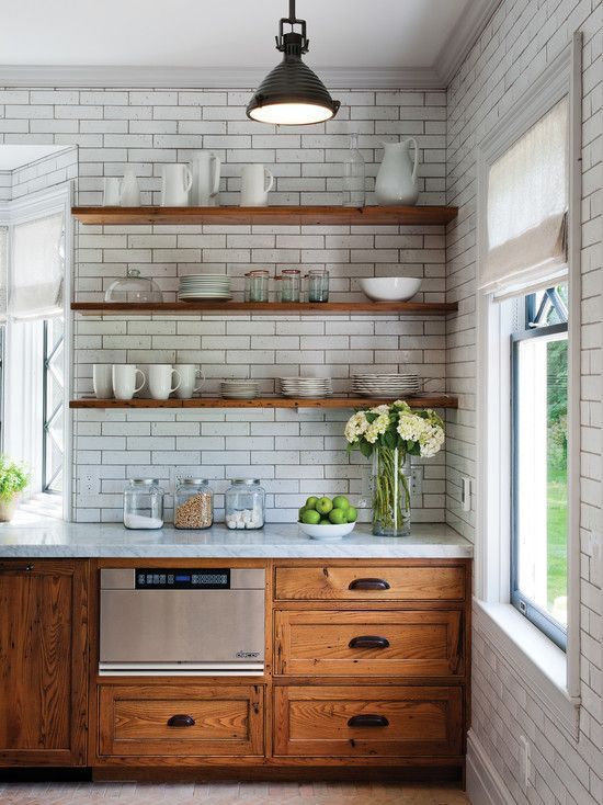
There are so many shades of white cabinets right now and so many detailed finishes that can all really change the look (from stark white to warm antique white, from a solid finish to a gel stain glazed into the corners).  White cabinetry is not always just plain white.

White tends to give you so much more flexibility with the other finishes in the space – you have practically no limit to the flooring, backsplash and wall options, when it comes to either color or pattern.  This is a huge, huge advantage over trying to work with a wood tone.

Yes, lighter cabinets show dirt and dust build up faster than darker finishes.  I would argue, however that in sunlight, dark cabinets often show build up more while adding on much more visible water marks from wiping cabinets.  Besides, sometimes knowing when your cabinets need a wipe and being able to have them actually look clean when you do it is a nice thing.


Dark cabinet considerations:

Dark cabinets have a rich, warm, solid, inviting feel.

They can make a space feel cozy and luxurious.

 In a mainly-winter climate (hello Northern Hemisphere people), it’s important to remember that sunlight bouncing off snow is very blue or grey.  It makes all other colors look bluish or greyish – imagine wearing faintly blue-tinted glasses and looking around your room.  To counter this, a warm toned room feels really good.  No soul on a snow-covered tundra in February wants their home to feel more icy and cold.

There are a lot of shades of dark wood stains available – from warmer reddish browns to stark, almost grey-black tones, so it’s possible to get a variety of looks in darker wood.

Having said that, it can be difficult to match or coordinate the wood tone of the cabinets with other wood tones in the house, either more permanent elements (flooring, baseboards, doors) or the more flexible items (furniture, accessories).  This is the classic problem with a kitchen renovation where you don’t have (or want to create) a blank slate in the rest of the house.

Cabinets can be stained with a rub-in semi-transparent stain which shows the grain or sprayed with a solid stain – both have very different looks, so there are a lot of options here as well.

A wood tone with visible grain adds a visual texture to the room – this can be a great natural element but it can also make it difficult to choose other finishes for the space, especially a patterned backsplash that can often compete visually and make things very ‘loud’.

A kitchen with dark cabinets really looks best balanced with a lot of light – rooms with large windows are a prime candidate for gorgeous dark cabinets but even rooms with little natural light can look beautiful with carefully considered lighting (LED pot lights, lots of bright and airy pendants over an island, an oversized fixture hanging over the table).

Darker cabinets tend to have more visible sheen due to their finish and this can make people crazy trying to wipe off drips and smudges, and then polishing those wet cloth marks away.  Even though the general impression out there is that dark cabinets are easier to keep clean, dark finishes do show dust and smudges just as much as lighter cabinets with the added bonus of also showing water marks when they are wiped clean.  Is it possible to keep dark cabinets gorgeous, though?  Of course and for many people it’s worth it.


What do you love?

As you can see, there are benefits and challenges to either scenario and what I always end up recommending to my clients is that in the end, you just have to go with what you love and work out the details surrounding it.  Chances are, there is a dream kitchen in your mind and it has a certain look to it that you are in love with.  More often than not, it’s a look you return to over and over.  Maybe you are trying to convince yourself that something else is a better fit – I wouldn’t go down that road.  Go with what you know you love and it will be something you love.

Now for the rest of the picture...


Balance & Details

Once you’ve chosen a cabinet finish you need to balance it out.  What does that mean?  Well, whatever you do with that big, huge, dominating presence in your room (the cabinets), you are going to want to do the opposite for a lot of the other elements in the space. 

If you are going with dark cabinets, you are going to want to make sure you have lots of lighter elements in your room.  These can be things like actual light (windows and light fixtures), lighter and brighter ‘permanent’ elements (backsplash, countertop, flooring, appliances)  and visually lighter accessories (big, airy art pieces, a huge mirror, creamy white throws, a large light colored centerpiece on the table, lighter throw rugs, white furniture, etc).   

If you choose to go with white cabinets, you are going to want to balance things out with some darker elements to ground your space, warm it up and keep it from looking like a white cave or sterile operating room.  In this case, you would take that list above and consider those things in some nice dark, rich tones.

One last thing that really pulls together the look and feel of a space – it’s all framed by those details.  Regardless of the color or tone of your cabinetry, it's the style of the doors, the type of hardware, the light fixtures, the accessories, the art and the furniture that give a room it’s polish and it’s mood.  I’ve seen black cabinets that are at home in a rustic country kitchen and pure white cabinetry that is right at home in an ultra modern kitchen.  Take a close look at those small elements in some of the kitchen photos that you love – I bet you will find that many of them share a similar style.


To Match or Not To Match

And finally, to answer your question about matching cabinets and built-ins – this is something that can also go either way.  On one hand, if the flooring is the same throughout both spaces, I feel like giving the kitchen some division by having a different color works well.  The living room doesn’t want or need to feel like a part of the kitchen.  On the other hand, if you have different flooring in both rooms, another color for the trim, and possibly even more wood tones in the doors, furniture and bathroom cabinetry, it can add some cohesiveness to maintain the same cabinetry throughout a house.  I would aim to pull things together if they need it (keep it the same) or give some definition to the spaces if they don’t (do two different finishes).


Looking to Pin for later?

Here you go!

true design house - dark or white - 22 - pinterest - 4.png

The Best Wall Paint Colors To Go With Honey Oak


If you are surrounded by honey oak in your home, you are in the right place for design help!

Are you living in a home that is filled with outdated oak and it’s just not feeling like you?  Most of my clients that approach me with this problem are feeling a little stuck: they are awesome people that have great taste and style but for a whole bunch of reasons, they are having to create a beautiful home around the oak that exists there.  All they want is a house that makes them feel happy when they walk in the front door, oak and all, starting with the paint color.  Is that even possible?

I get it:  try searching online for ‘oak kitchen’ or ‘oak trim updates’ and the inspiration and advice is pretty dismal.  Standard advice is to either rip it out or paint over it.  This isn’t always practical or even what everyone wants.  The more a person searches, the worse you start to feel about your house.  Any photos you can find seem to be mostly really ugly and, well, depressing stock photos. All you want is a simple update, without a major renovation.  The good news is that yes, it is possible to do and I can show you how.  Paint is the easiest and least expensive things you can do in a home and the best part is that it is one of the biggest game changers.  Can you choose a gorgeous paint color that makes your home beautiful updated and lovely, without touching the oak?  Yes!

d4025f7b49a85b7492958891233c34e1.jpg
sarah-dorweiler-105892-unsplash.jpg
 

The Three Steps to tackle updating your oak (and one bonus step!)

I have helped clients to tackle this problem so many times and I can guide you through the process as well. There are 3 steps to navigating choosing the right paint color (and one bonus step), so let me help you to work through them!

1. Accept the great parts of the oak in your home (and there are some!)

2. Understand a bit about color theory

3. Take a look through all of these color suggestions and try a few out at home.

4. Bonus: I have an entire ebook on this topic, so consider buying the Living With Oak: 2021 Design & Style Guide to let me take you step-by-step through setting up a plan to updating more than just the paint in your home.

 
TDH - woman with phone
Living with Oak ebook, bonus content. The best paint colors to update honey oak.

Step One: Why work with the oak?

There are some great things about oak in a home and though, yes, it can be painted over or replaced with MDF trim or a new white kitchen, there are a lot of reasons to leave it be and work with it!

Oak is a rock solid wood – it’s durable and practically bullet proof.

It’s warm – those warm tones are earthy and look great in a lot of spaces.

Oak is also ripe with wood grain that really stands out, even when painted, so it has a very natural, patterned look that never looks manufactured or ultra-modern.

Even if the only reason it’s staying put is because you don’t have the time, money or desire to replace it right now, it absolutely can look great in your home by surrounding it with a great wall color and surrounding it with things that are more in your taste – things like furniture, art, lighting, new hardware or updated counters will all help give a new look to the space and put all thoughts of ‘outdated oak’ right out of mind.


Step Two: Color Theory

When it comes to updating a house, you better believe the oak can absolutely be toned down & styled to look good with a fresh wall color.

There are two main ways of working with any existing element in a home: it can either be enhanced (used as a focal point) or downplayed (neutralized and camouflaged). What we are going to focus on is the idea that oak, which just boils down to an overwhelming amount of a yellow-orange color and lots of texture, needs the rest of the room to balance it out. It needs to be downplayed, neutralized and camouflaged.

To achieve this with paint, either we are going to create a harmonious palette that is similar to the oak, or we are going to create a contrasting palette that incorporates some opposite colors. Either way, we are going to pay attention to those subtle undertones so that the oak looks it’s best.

Here are the two directions to transform your honey oak trim, doors, or cabinets with wall color:

1. Neutralize it with a complimentary color

Oak can be neutralized a bit by using colors around it that are on the opposite side of the color wheel. So, for orange oaks, this means something with a purple or green tone. Does it have to be a loud, obvious purple or green? Nope! There are undertones to a lot of soft, neutral colors like warm greys and creams. Yes, the oak is going to stand out: it’s going to sit among a contrasting color like a piece of art sits in a mat and frame. That’s okay – let’s be honest, it exists, it is there and you can’t make it disappear, but you can trick the eye into feeling like what is there is a little less “loud oak” and a little more “neutral warm wood”. Think of a gorgeous redhead wearing a soft lavender top – beautiful. Redhead wearing a harsh yellow shirt? Not so flattering.

2. Blend and camouflage

If you surround the warm oak with another warm color, it’s going to blend in and look purposeful. A soft, warm neutral paint with orange or yellow undertones can make a space look harmonious and help the oak fade in a little. I would go with a natural, earthy color here, not anything too harsh. The look of warm oak is very natural and can sit very nicely with colors pulled from nature. Be careful not to choose anything too bland here as you do want your space to have some energy to it and avoid harsh black-greys as they generally just don’t work well.


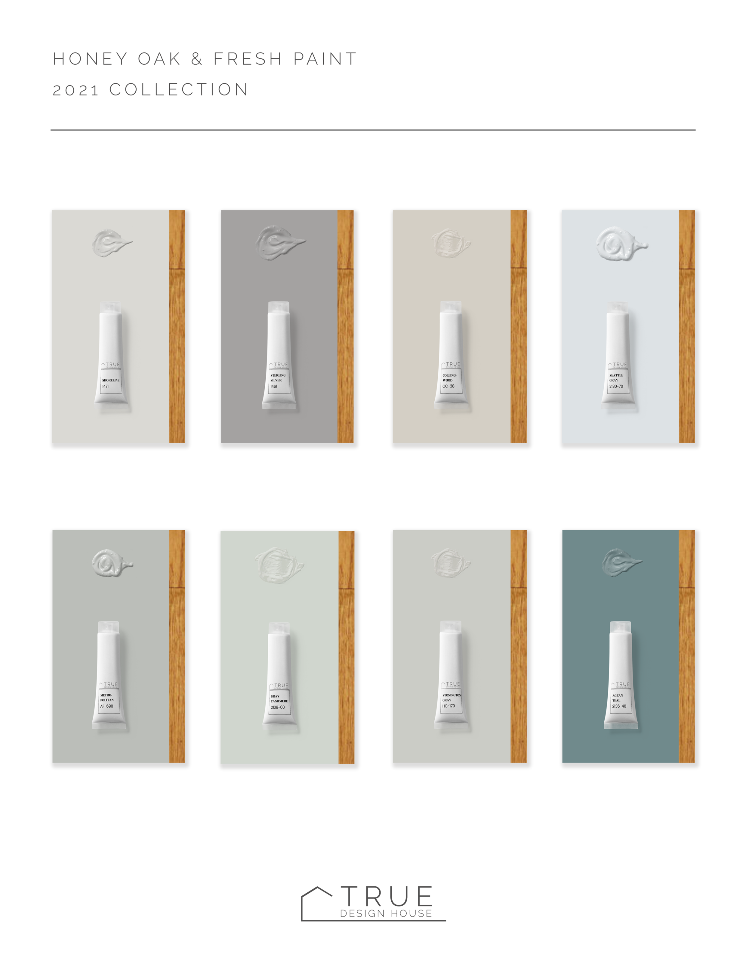
Step Three: Color Suggestions for 2021

Color styles and trends are always evolving and while I believe that a foundation of good design is timeless, I thought you might like to see what paint colors I’m pairing with oak in 2021.

For a download of this cheat sheet complete with all the paint codes, take a look at my my free design resource library (link below!)

Get the 2021 curated collection of the best paints to pair with honey oak.  Immediate, free download from True Design House.  Interior design advice for the practical & down-to-earth. {{ true-design-house.com | #BenjaminMoore | #DesignHelp | #DIYStaging | #HomeAdvice | #HoneyOak | #OakFloors | Interior Design Tips | Home Design Help | The True Design House Best Paints With Honey Oak 2021

Get the 2021 curated collection of the best paints to pair with honey oak. Immediate, free download from True Design House. Interior design advice for the practical & down-to-earth. {{ true-design-house.com | #BenjaminMoore | #DesignHelp | #DIYStaging | #HomeAdvice | #HoneyOak | #OakFloors | Interior Design Tips | Home Design Help | The True Design House Best Paints With Honey Oak 2021

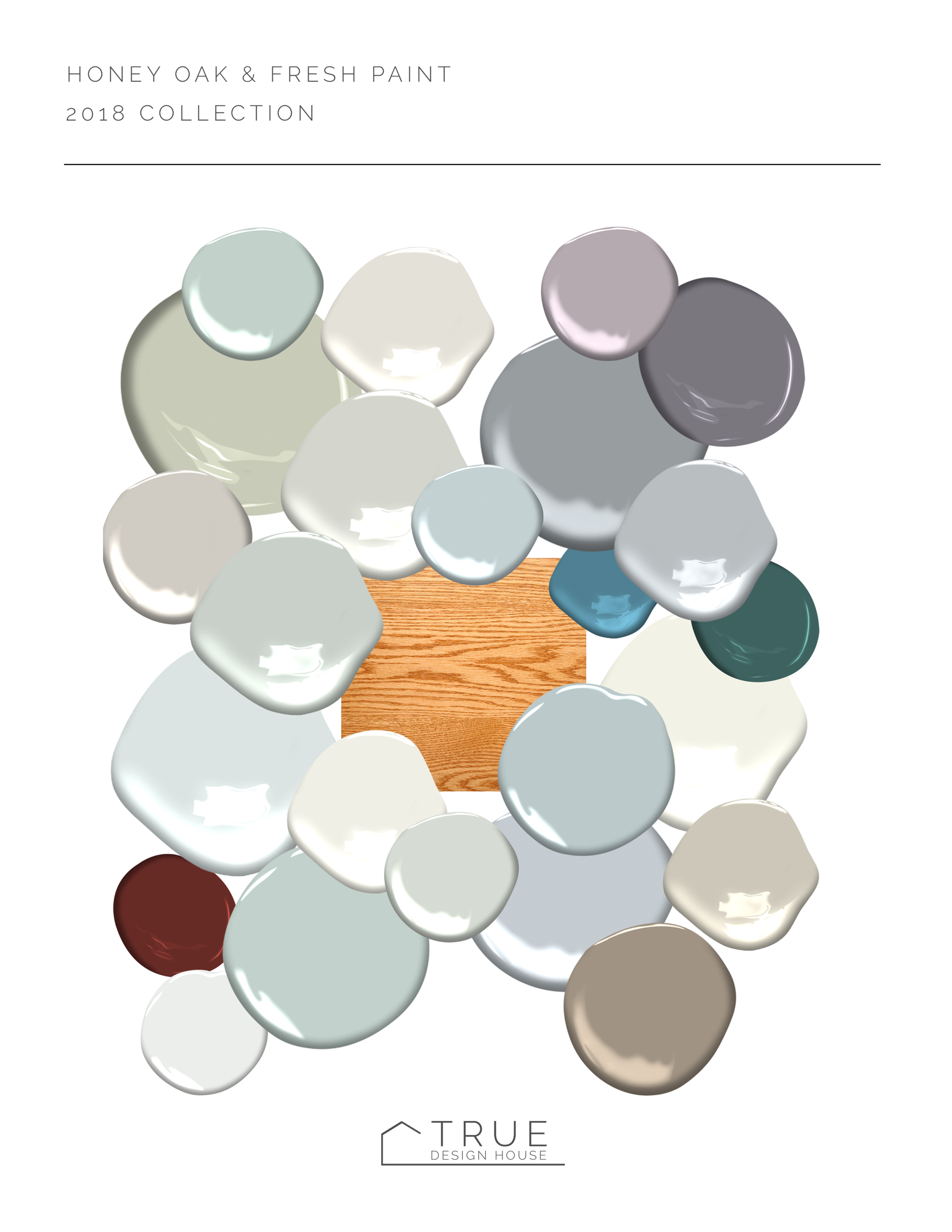
Looking for the still popular 2018 collection? It can also be found in the resource library!

Get the 2018 curated collection of the best paints to pair with honey oak.  Immediate, free download from True Design House.  Interior design advice for the practical & down-to-earth. {{ true-design-house.com | #BenjaminMoore | #DesignHelp | #DI…

Step Four: Bonus step!

There is so much to unpack about updating oak in a home (and yes, it’s totally possible!) and paint is only one aspect.

The problem with looking for design help online is that a lot of information is, well, a little sad.

If you are looking for real, inspirational, down-to-earth design advice about taking your home from wherever it’s at now to updated and stylish, maybe my ebook is just what you need to get started.

Check it out below and see if it’s a good fit!


The Surprising Importance of Color in Winter - 3 Ways Your Paint Color Matters to Your Health

Right now in my circle of friends and in my client meetings there is something that has been coming up more and more often.  For those of us looking forward to months of winter there seems to be something on our mind: winter gloominess. Llately I’ve been asked a few times if doing something different to our homes can help offer some relief to the dark and gray of winter and the way it can make a person feel, which is: not good. (And the answer is a solid ‘hell yes!’)

Seasonal Affective Disorder is a sub-type of depression that burdens a whole lot of people who face long, dark, cold winters every year and the further a person lives from the equator the more prevalent it becomes.

In simple terms, here’s what happens:

Sunlight = serotonin = happy

Darkness = melatonin = sleepy and hungry

Shortened days + daylight saving adjustment = circadian rhythm thrown off = hormone production thrown off


What does SAD look like?

Symptoms can be ‘not fun’ and many people find they are just generally feeling ‘blah’ without really putting a finger on what exactly could be going on.   I’m (obviously) not a medical professional (pause for laughter) but if you are feeling any of these symptoms creeping into your life, maybe give some thought to Seasonal Affective Disorder.

Unusual sleep patterns

Extra hungry, especially for carbs

Weight gain

Lethargy

Withdrawal, craving solitude, general disinterest in regular life

Nervous, anxious, unable to concentrate


Taking action

So, the good news is that for a lot of people doing some small things can help in a major way (we’ll get to the one I know the most about in a minute because I’m an interior designer and not a doctor).   Get your google on with these common suggestions:

Light – sunlight or artificial light therapy

Exercising outdoors – exercise, fresh air and sunlight

See a professional – therapy in many forms can help, from acupuncture to talk therapy


Here’s where I come in

This is all so prevalent here that I take it quite seriously in my design work.  I always mention low light and the blue tone that bounces off the snow outside when clients and I are talking about paint colors.  It’s my duty.  I think I took an oath about this once. 

Statistics say that at least one member of every house where I am designing will suffer from Seasonal Affective Disorder, not to mention it just plain feels better to have a home that feels warm, happy and cozy.  It’s a long, long winter, man.  If you don’t live this far north, in the vast prairies especially, you might not feel the same, but winters can be brutally hard on the psyche.  We have to stand up and fight back.  In a cheerful way.  Let’s have a group hug and sing O Canada.

So, what about the psychology of color?  What should you be thinking about when you are choosing wall colors for your frozen northern homestead?  Here are 3 things I try to cover when helping my clients.


subtitle 1.jpg

The light that bounces off of snow is very blue.  In the depth of winter here it starts to get dark in late afternoon (4pm) and it stays dark until after breakfast the next day (8:30am).  (Let us have a moment of silence for those that live in that year after year.)  Imagine a very pale blue or grey transparency sheet over every swatch of paint you are looking at.  Be kind to yourself and go a touch warmer than you are first considering.  You can still maintain clear, crisp colors without looking muddy or yellowed if you just go a touch warmer.  Hold3 similar shades in a row and you will see clearly which one looks warmer (more yellow, red, or orange).

If you love a very pale color, consider going just one shade darker.  The richness will compensate for that pale light that comes through when it’s overcast yet still hold its color when the glaring sun is bouncing off the ice outside on the clear days.   So many people fall in love with that ‘just perfect’ shade of barely-there color only to be sadly disappointed when they paint their room and it looks washed out to a muddy white or grey.

Your home is an extension of the people that live there.   It is not the post office or a sad college dorm.  Live it up a little; go all in with something you love.  You can boldly use a color that makes you feel good and you can do it in a way that makes you and your family happy, without going overboard.  If you love hot pink, paint one wall in your powder room.  A block of bright pear green in the mudroom can look great.  The wall behind your king-sized headboard can be the boldest turquoise.  It is only paint and even if you never want to change the color itself, you are going to repaint eventually anyway.  Consider a crazy color a short term investment – be smart about where you use it and know that when the time comes it’s going to cost you $50 and take an afternoon to erase it and go in a whole new direction.  Totally worth it!


I hope that this has given you some helpful ideas for having a better winter in your home!  Here's to a cozy feeling inside when it's freezing and grey outside!


Ready to love where you live?

Join 25 000 others for instant access to my library of free, practical, and down-to-earth interior design resources!

Looking to Pin for later?

Here you go!

true design house - winter color - 6 - pinterest - 4.png