Plunge In: My Top 5 Paint Colors for Deep, Moody Walls


Color is a metamorphosis of a space and it is absolutely a complete game changer.  There is nothing you can do to your space that will have more impact than simply painting it.

A great color can influence a person at the deepest level.  It can be calming, inspiring, energizing, comforting, revitalizing.  There are so many reasons to just go for it – plus, it’s the best use of money you will spend on your room transformation (and it doesn’t take much money, either!)

A rich color just turns up the volume on all of the great things in a space: it makes a statement.  A soft color whispers , which is just fine in most spaces but sometimes you need a little bit of energy.   Plus, a pale, non-committal color can be a little... boring.  Even an ugly, sad beige says something to you daily, whether you like it or not (and, sadly, what it usually says is something along the lines of a tired, drawn out whine... and you deserve better than that.) 

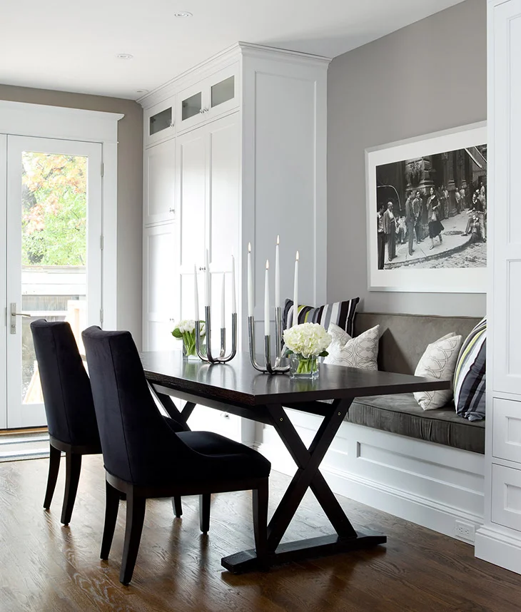
Going dark and turning up the intensity is a bold move so you want to get it right.  You need to avoid just being loud and obnoxious - you want the right amount of pigment with the right amount of depth.  Without some maturity, your colors sway drunkenly into ‘fast food joint’ or ‘teen girl bedroom’ pretty easily.  These suggestions will help you to stay on the luxurious, amazing side of bold color.

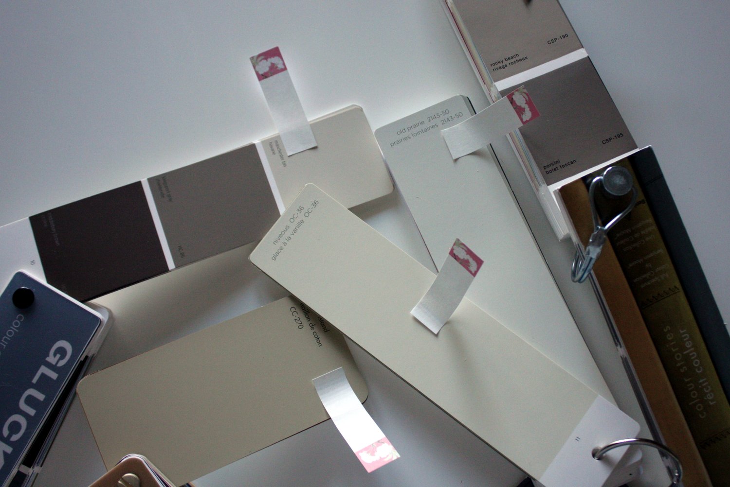
If you have the courage and are ready to plunge into some real color, here are my top picks for bold, inspiring paint colors that say something great. Scroll to the bottom for a list you can save & print.

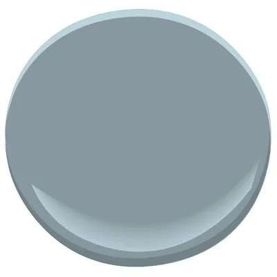
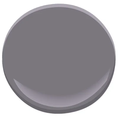
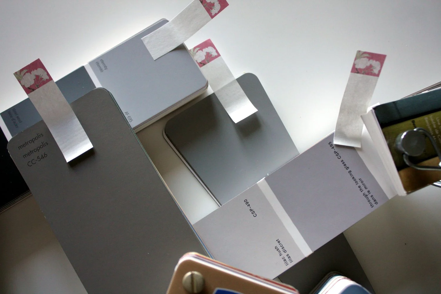
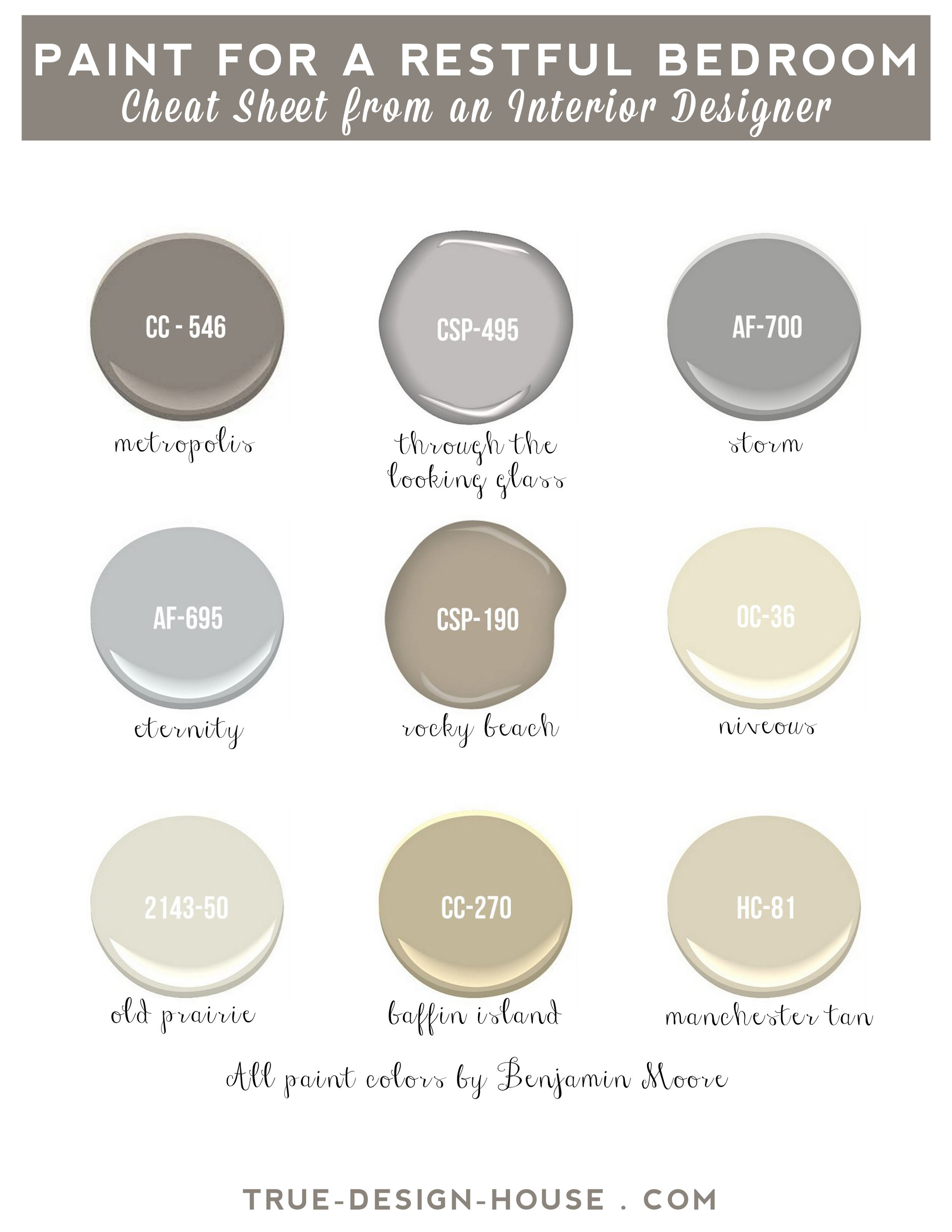
Check out my top picks for deep, moody paint colors right now!


Ready to love where you live?

Join 25 000 others for instant access to my library of free, practical, and down-to-earth interior design resources!


Looking to Pin for Later?

Here you go!

true design house - moody paint - 27 - pinterest - 4.png

5 Soul-Focused Tips for Designing a Feel-Good Room


A personal style is like handwriting – it happens as the by-product of our own way of seeing things, enriched by the experiences of everything around us. - Massimo Vignelli


Designing a space that is ‘just right’ means pulling together things that make you feel good and that remind you of warm memories.  You will be at your most comfortable when you are surrounded with things that make you happy and remind you just why it’s good to be you.  Here are 5 soul-focused tips for doing just that.


1.       Clear the clutter

Get rid of stagnant energy by clearing out clutter.  These piles and nests of stuff tend to harbor bad feelings because they are normally things you need to deal with, are unfinished or regret buying or owning in the first place.  Quickly evaluate what you really need to keep (then put it away properly or deal with it right away) and get rid of everything that no longer serves you.


2.       Turn up the volume on some great color

The psychology of color is vital to creating a happy space.  Yes, there are studies and charts to help you find a color that might give the mood you are looking for, but if that’s not your thing, take a look at your closet or the rest of your house.  What colors are you drawn to?  What makes you feel good?  It’s also important to think of the energy you want your room to have – brighter colors tend to be ‘louder’ and be more energetic.  Muted tones tend to be more soft and restful.  Dark, bold colors tend to have a solid, heavy feeling.  Adding color can be as subtle as small accessories or a throw, or as bold as painting the entire room.


3.       Add a few memories

Having little touches of things that warm your heart is the best way to make a connection with your space.  Things like pictures of tender moments with your children and happy photos from around your home are easy fits here.  Don’t overlook more abstract mementos, though.  In my house I have on display a rock collection from summer walks with my kids, a few feathers in a vase brought to me by my son, and a watch that belonged to my husband’s grandfather.  All of these things make me smile when I look at them.


4.       Nod to nature

A connection to nature will bring life to the space.  Consider plants, fresh flowers, rocks, rough wood, water features.  Don’t overlook big, open windows (keep those blinds open and hang your curtains outside the frame), especially if you have a view of trees or a garden.  If plants aren’t possible or just aren’t your thing, there is nothing wrong with a good quality fake, or consider the other non-living alternatives.


5.        Let all that isn’t you fall away.

Evaluate everything in your space.  Get rid of things that just aren’t you - you know you have at least a few things that just bother you for whatever reason – au revoir!

(If you like this image, you are welcome to save it and use it as a phone wallpaper!)


Ready to love where you live?

Join 25 000 others for instant access to my library of free, practical, and down-to-earth interior design resources!

Looking to Pin for later?

Here you go!

true design house - soul focused design - 26 - pinterest - 5.png


The Best Wall Paint Colors for a Restful Bedroom


Choosing the right wall color for your bedroom is kind of a big deal! 

Your bedroom is the most intimate, private space in your home and because of that it tends to be almost a physical representation of your inner self.  How you feel when you are in that space sets the tone for the rest of your day, which is why a restful wall color is so important.  Sleep and restoration are vital to our well being but there are also some other things to consider when choosing a wall color.  There are a few things to consider when choosing a wall color that will make your bedroom your favorite place in the house.


The colors that are best for a restful bedroom provide a rich, calm, neutral backdrop to the space. 

These paint colors are all a good balance of warm and cool, which is important as you want this room to look great in the dim light of an evening lamp as well as in the morning sun. 


Remember the importance of the Psychology of Color

To say that color affects mood is a subtle understatement – color absolutely shapes our emotional state.  The space where you go to recharge needs to have a color that fits well with what’s most important to you.  (Bedroom goals, anyone?) 


There are the three main aspects I think about when choosing a bedroom paint color

There are three things I think about when choosing bedroom paint colors and though I try to make sure that a color will work for all three areas, I know that everyone has a different priority so I focus on one area first.  For example, it’s possible you want a really cheerful bedroom and that is your priority, then I would say go for a color that nails that, but just take a moment to think of the other areas and make sure it’s not a total clash.  If you can find a color that feels right in all of these scenarios, you’ve nailed it. 

Is it Cheerful & uplifting?

Is it Peaceful & calming?

Is it in line with your relationship goals - romantic, feminine, masculine? 


Think of your room as a palette of colors

After painting the walls that perfect neutral, layer 3-5 colors, textures or patterns throughout the room for a cohesive look.  This is the time to get bold with your colors if you want to, or to really play up a soft monochromatic look.  By creating the neutral backdrop and layering in several ‘louder’ colors or statement pieces, you will have so much more flexibility and your space will feel so much more polished.  Put samples of the color palette together, including the furniture and flooring colors, before you start adding in bedding, accessories or art to make sure the colors are going to fit together in the style you’re hoping for.


restful bedroom.jpg

Here are my picks for the best wall paint colors for a restful bedroom.

Use this list as a starting point. 

Print it out and take it to the paint store, gather some samples and see what you love.  Lighting conditions are the most critical factor in how paint looks in a room and whether it will work or not, so paint a few samples and test the color out in all the lighting conditions the room will normally see.  Most importantly, just go for it!  Get started and find something you love – you deserve a restful bedroom!


Ready to love where you live?

Join 25 000 others for instant access to my library of free, practical, and down-to-earth interior design resources!

Looking to Pin for later?

Here you go!

true design house - restful bedroom - 25 - pinterest - 5.png


The Anatomy of Flawless Wall Art Placement


Today I am answering another great question from my inbox!

Hi Tara, I have a few questions about art placement in my living room.  How high above the sofa should art be hung?  To what scale should art or decor be to a wall?  I am wondering, should photos be staggered or in line with each other when making a grouping?  Thanks so much!


Hello!

This is a great question not only because it’s so universal but also because getting it right can make a huge impact in your room.  I mean, there is a lot of grey area where things can look ‘okay’, but if it’s very wrong it can draw a lot of (bad) attention.   If you nail this, it takes your room to another level.

The main design goal when hanging art is to create a pleasing sense of proportion.  Having things sit in nice relation to each other looks so wonderful.   There are several guidelines that can be used to achieve that, but in the end you just want it to feel right.  It’s very obvious to understand that if you imagine a tiny print hanging awkwardly by itself to the side of a huge blank wall.  You would take one look and know it doesn’t feel right.  Now, the ‘feel’ of this question is a little hard to translate into an exact lesson, but  if you trust your gut to tell you when it’s not right then you can use these tips to narrow down just what to do about it.  Once you start thinking in terms of proportion, it’s easy to get things looking great.

These are common guidelines that I use for myself when I’m advising clients on hanging art or laying things out myself.  These should get you started and give you some things to consider, but remember to lay it out then see how it feels before committing.  Sometimes breaking a rule is just the right thing to do.  Not every rule applies to every situation - you’re getting a smattering of what’s in my mental toolbox as I’m thinking things through!


pexels-photo-large.jpg

Vertically center the art at eye level

The horizontal line running across the piece should be about at eye level of a standing adult of average height (60” or so).

The rule of thirds

Divide the wall into 3 horizontal bands and try to focus the art along the line between the top 2 sections.  This is a photography rule but it works in interior design as well.

The art belongs to a family

Make the art part of a visual grouping with the dominant things around it – windows, furniture, lamps, plants, etc.  If you can bring the art closer in relation to those things, rather than floating ungrounded in the dead center of a wall, you will create an eye-pleasing vignette when looking at the groupings in the room.

Prioritize

Although, the above tip is my go-to plan, there are times when there is a really dominating architectural feature in the room (pillars, a large grouping of windows, built in book cases) and then it’s often a better fit to lay out the art work with those features as the main grouping, then arrange the furniture around that to balance the room (or balance with plants, etc).  For example, if there are two large windows with a wall space in between, I would center the art between the windows first.  Then, to balance the room I would arrange the furniture where it fits best, and if that is not working with where the art is on the wall (if the furniture is all to one side), I’d add a large plant or a floor lamp with a basket of blankets, maybe a small table with a little grouping on it. 

Grouping

A gallery should have a main shape to it (a square, rectangle, oval, etc).  All the frames should more or less fit into that shape in a balanced way.  Some edges can be ‘loose’ but the core of the grouping should have some structure.

Spacing

Especially in large galleries, it looks best to leave a consistent, even spacing between all of the frames and let the outer edges be a little free-formed.   2” is about average.  When the outer edges of a grouping are a uneven, try to balance things by having that extra visual weight on both opposite corners or sides.

Practical Hanging Tips

Use a measuring tape – ensure your picture will be exactly where you want it before nailing into the wall.

Level  up – straight pictures make a heart happy.

Dot it – put a small dot of toothpaste on the hanging spot on the back of the frame, then hold the frame to the wall and press.  You will get perfect placement for the hanging hardware,  just wipe off the toothpaste and you are done.  I have used this tip for years and it works perfectly every time.

Templates – use a piece of cardboard or wrapping paper and some painters’ tape to test out art placement on the wall. 

Gallery tips - A large template of the core shape for a gallery grouping can help you figure out shape and sizing, then can be laid on the floor to lay the frames out on it.  Use the toothpaste trick to put dots onto the template, tape the template to the wall and nail through the dots.  Rip off the paper, hang the frames and your gallery will be perfect.   Also helps to take a picture with your phone of the gallery layout on the floor to make it easier to remember where everything goes as you are hanging it.  I also sometimes use sticky notes to number the frames before taking the picture if they are similar.


Ready to love where you live?

Join 25 000 others for instant access to my library of free, practical, and down-to-earth interior design resources!

Looking to Pin for later?

Here you go!

true design house - art placement - 24 - pinterest - 4.png

Why Change is the Key to Happiness


My clients often teach me just as much as I teach them when we work together.  This is a lesson from a few clients I've been working with lately:  take the leap.  Make a change, even when you're not exactly sure what to do, even when you're uncertain.  Knowing that what you are living with just isn't right, that's enough reason to just begin.  Go ahead,  add some happiness to your home!

Change is hard, isn’t it?  Even when we sort of know we could change things in our life, even if we know just what to do to make things better, we just... don’t.    I think it’s that we all crave comfort and that can mean staying the same place long after something stops serving us, stops making us feel our best.  Thinking outside the box, making a leap, making a statement to the universe that you are willing to do something new is a powerful thing for your psyche.   Often, making a small change in our lives or our home becomes that first drop that causes that ripple effect, don’t you find?  If we can just have the courage to make one bold change, it feels so good and we have no problem finding that momentum to continue finding things to fine tune.

Comfort, predictability, stability – these are all things we love when you think about it, but they can be a huge source of unhappiness for a lot of people.  How is it that the need to feel comfortable can keep a person tied to things in their life that are sources of discomfort?  If you are living with something in your home that’s not uplifting you, it might be time to just take the plunge and make a change.

I see this often in my work, where a client has lived with something they hate in their home and they know they want a change, they often have a great plan for just what to do, but they need some reassurance that what they want to change is going to be great.  Basically, they need someone to push them out of the plane!  Ideally, before doing that, this person can also help hash out a solid plan for going forward and be able to work through every question and doubt, providing examples and information, until they feel certain and excited about the plan! 

pexels-photo-large.jpg

In all reality, fighting change is a losing battle.  Happiness is found in flexibility.  Yes, it can be uncomfortable to change, but it is worth it.  This is the natural course of life, to put something to rest to make room for something new.   Yes, it’s unknown and can feel like maybe it will be chaotic or not work at all, or maybe be worse than before, but it doesn’t have to be that way.  The reward is worth  the risk.  I think being able to think out a good plan and take action on it is often something that just has to be tackled without putting much weight on your feelings about the changes.  It’s going to be great!  Focus on the framework of what you want to change, the ‘why’s and put some time and thought into your plan.  That is the structure of what you need to do.

Add some happiness to your home.  Happiness is anything that you love, that makes you smile, that makes you feel good when you pass by it or exist with it.  Organizing your Tupperware drawer, rearranging your bedroom furniture, printing and framing some beautiful photos from a great vacation you took, even just streamlining your mudroom.  All of these bring joy to your life and like ripples in water,  that spreads.  Trust me,  being happy in your home matters. 

There are bigger things, yes.  Paint a wall or a room.  Paint your front door.  Buy a new chair.  Your home is worth these things.  Start to think of your home from the perspective of upping your happiness.  Choose things that make you smile. 

Ready for even bigger? Tackle that kitchen renovation.  Revamp the exterior of your home.  Finally put in that patio in the backyard.  Go for it.  Your dreams and enthusiasm and ideas are valuable.  

A lot of people do things like this, they feel the need to make a change, they plan it out and they go for it – why not you?


Ready to love where you live?

Join 25 000 others for instant access to my library of free, practical, and down-to-earth interior design resources!

Looking to Pin for Later?

Here you go!

true design house - change - 23 - pinterest - 4.png