
The Anatomy of Flawless Wall Art Placement
Today I am answering another great question from my inbox!
Hi Tara, I have a few questions about art placement in my living room. How high above the sofa should art be hung? To what scale should art or decor be to a wall? I am wondering, should photos be staggered or in line with each other when making a grouping? Thanks so much!
Hello!
This is a great question not only because it’s so universal but also because getting it right can make a huge impact in your room. I mean, there is a lot of grey area where things can look ‘okay’, but if it’s very wrong it can draw a lot of (bad) attention. If you nail this, it takes your room to another level.
The main design goal when hanging art is to create a pleasing sense of proportion. Having things sit in nice relation to each other looks so wonderful. There are several guidelines that can be used to achieve that, but in the end you just want it to feel right. It’s very obvious to understand that if you imagine a tiny print hanging awkwardly by itself to the side of a huge blank wall. You would take one look and know it doesn’t feel right. Now, the ‘feel’ of this question is a little hard to translate into an exact lesson, but if you trust your gut to tell you when it’s not right then you can use these tips to narrow down just what to do about it. Once you start thinking in terms of proportion, it’s easy to get things looking great.
These are common guidelines that I use for myself when I’m advising clients on hanging art or laying things out myself. These should get you started and give you some things to consider, but remember to lay it out then see how it feels before committing. Sometimes breaking a rule is just the right thing to do. Not every rule applies to every situation - you’re getting a smattering of what’s in my mental toolbox as I’m thinking things through!
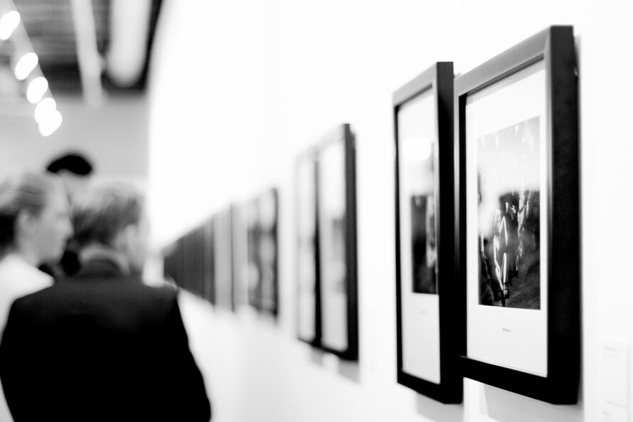
Vertically center the art at eye level
The horizontal line running across the piece should be about at eye level of a standing adult of average height (60” or so).
The rule of thirds
Divide the wall into 3 horizontal bands and try to focus the art along the line between the top 2 sections. This is a photography rule but it works in interior design as well.
The art belongs to a family
Make the art part of a visual grouping with the dominant things around it – windows, furniture, lamps, plants, etc. If you can bring the art closer in relation to those things, rather than floating ungrounded in the dead center of a wall, you will create an eye-pleasing vignette when looking at the groupings in the room.
Prioritize
Although, the above tip is my go-to plan, there are times when there is a really dominating architectural feature in the room (pillars, a large grouping of windows, built in book cases) and then it’s often a better fit to lay out the art work with those features as the main grouping, then arrange the furniture around that to balance the room (or balance with plants, etc).
For example, if there are two large windows with a wall space in between, I would center the art between the windows first. Then, to balance the room I would arrange the furniture where it fits best, and if that is not working with where the art is on the wall (if the furniture is all to one side), I’d add a large plant or a floor lamp with a basket of blankets, maybe a small table with a little grouping on it.
Grouping
A gallery should have a main shape to it (a square, rectangle, oval, etc). All the frames should more or less fit into that shape in a balanced way. Some edges can be ‘loose’ but the core of the grouping should have some structure.
Spacing
Especially in large galleries, it looks best to leave a consistent, even spacing between all of the frames and let the outer edges be a little free-formed. 2” is about average. When the outer edges of a grouping are a uneven, try to balance things by having that extra visual weight on both opposite corners or sides.
Practical Hanging Tips
Use a measuring tape – ensure your picture will be exactly where you want it before nailing into the wall.
Level up – straight pictures make a heart happy.
Dot it – put a small dot of toothpaste on the hanging spot on the back of the frame, then hold the frame to the wall and press. You will get perfect placement for the hanging hardware, just wipe off the toothpaste and you are done. I have used this tip for years and it works perfectly every time.
Templates – use a piece of cardboard or wrapping paper and some painters’ tape to test out art placement on the wall.
Gallery tips - A large template of the core shape for a gallery grouping can help you figure out shape and sizing, then can be laid on the floor to lay the frames out on it. Use the toothpaste trick to put dots onto the template, tape the template to the wall and nail through the dots. Rip off the paper, hang the frames and your gallery will be perfect. Also helps to take a picture with your phone of the gallery layout on the floor to make it easier to remember where everything goes as you are hanging it. I also sometimes use sticky notes to number the frames before taking the picture if they are similar.