
Need some design inspiration for your brick exterior? Looking for the best paint colors to go with brick?
Sounds like you’re ready to breathe some new life into the outside of your brick home - good news, you’re in the right place for some very specific advice & paint suggestions.
There are a few basic design theories and practices that take a brick exterior from tired to knockout and I’m going to walk you through them and, don’t worry, I also have a downloadable cheat sheet with a curated collection of 14 Benjamin Moore paint colors that will make your brick exterior beautiful.
Let’s get started!

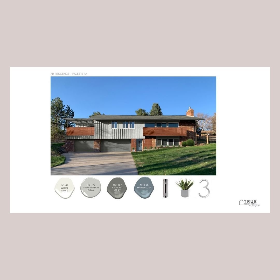
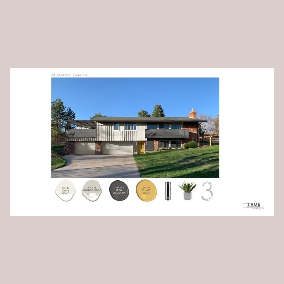
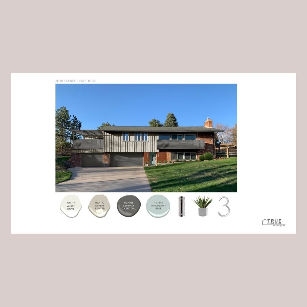
1. The 3 Color Rule
A general design rule of thumb is that exteriors look best with a combination of 3 colors.
This gives a good balance between the main overall background color and some details that can be a bit bolder without overwhelming the house. For most people, the goal is for it to be cohesive and gorgeous with just a bit of ‘oh, that looks so good!’ wow factor.

Main Color
The main color is what would normally be the central siding or stucco color. This is sometimes called a field color. This would be a nice, rich tone that you can live with for a long time or that is neutral enough for resale down the road.
If this is the brick portion of your house, then this is taken care of!
This color tends to be the biggest financial investment as well, so it makes good sense to go with something that can serve as a nice background for years to come.
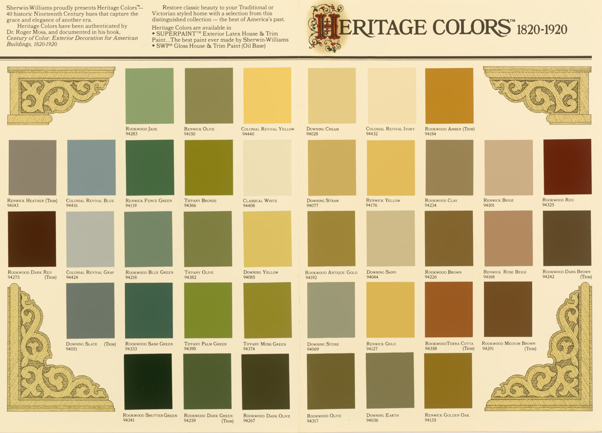
You can dramatically change the look of a good neutral main color by changing up the ‘quick and easy’ accent color in places like the front door or shutters, so choose wisely here. This is the time to consider the architecture of your home and of your neighborhood and to take a good look at heritage colors. These tend to be mature colors that have stood the test of time and are not likely to go out of fashion anytime soon.
You also want to think about whether you want to have your home color be cohesive with the rest of the houses in your neighborhood (mostly, the answer is yes!) You don’t want to be ‘that family’, right? Unless you do want to be, then go for it – whatever makes you happy!
Secondary Color (Or Secondary Grouping)
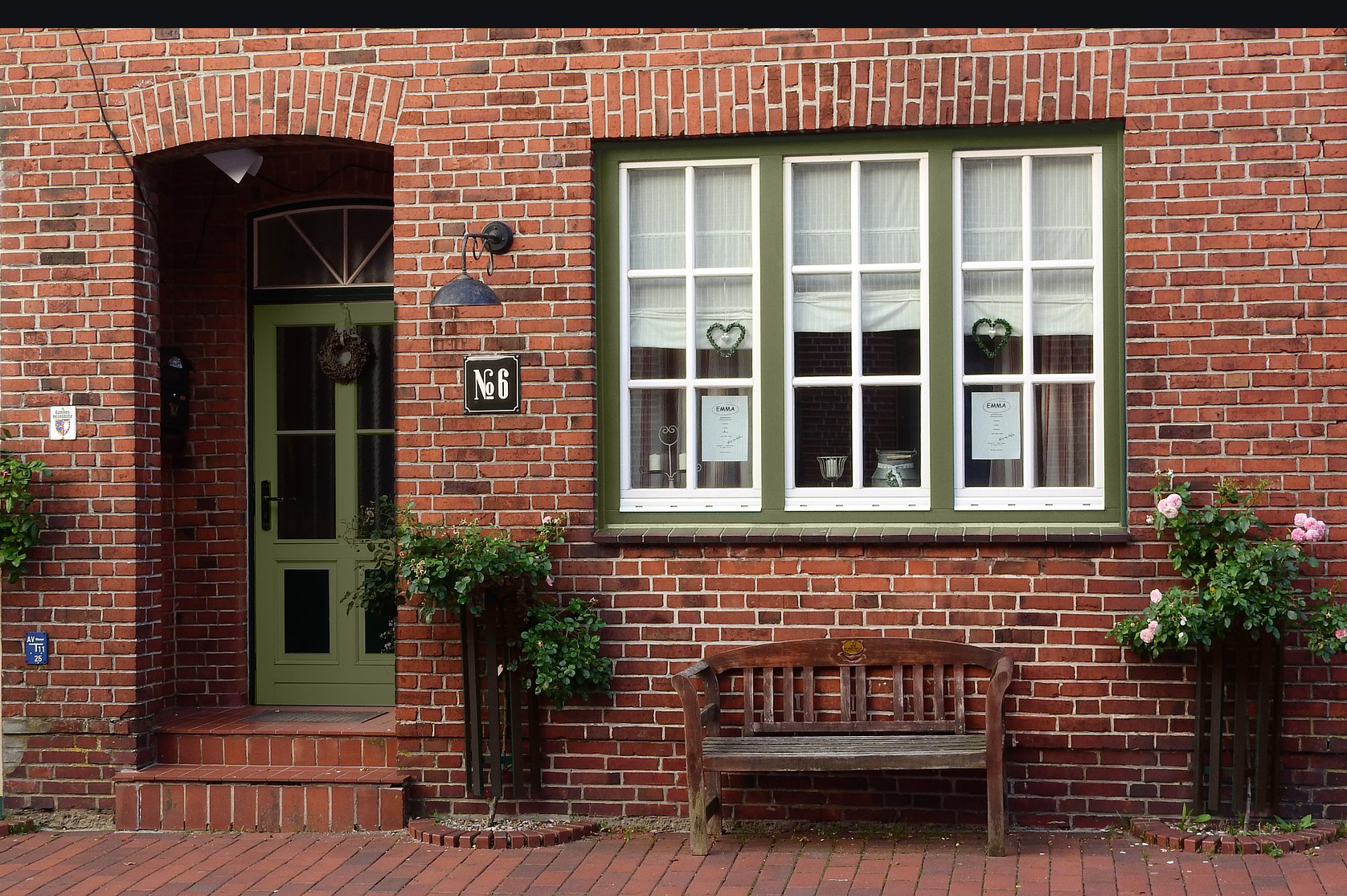
The secondary color is often seen in stonework on the front facade, like field stone, slate or possibly this is the brick we are talking about today.
The secondary color might also be the trim of the house – fascia, gutters, window trim, railings, etc. If there is not a lot of stone, I tend to let that sit as a ‘near-neutral’, a ‘secondary-secondary’ color because you kind of do need and want a separate trim color in a lot of cases.
Some houses will use a paint color for the trim that matches the stone and that can work as a ‘secondary team’ also.
This grouping of secondary colors should not take up a huge amount of the area of the house facade because you don’t want your stone and trim to compete with the main color of the house but you want to have more of this neutral color than your accent color.
This color is great to break up the facade of the house visually, highlight architecture (like windows, gables, flower planters and porches), and give some depth or balance to what can sometimes otherwise be a large, flat rectangle. You wants lots of contrast between the secondary and main colors in most cases.


The Accent Color
A bright, bold or eye-catching color might be perfect for the front door but would be a bit crazy on the entire house, which is where that third color, the accent color, comes in.
This is the place to go a bit bolder and choose something that will make a statement if you like. It can also be the place to, finally, show some personality in the exterior colors or to just use color to evoke some feeling.
The accent color doesn’t need to be a bright red door that announces your style to everyone who passes by, it can also be a deep charcoal paint on the shutters or a soft butter yellow on the porch floor. This is the place to create some style.


2. Perfect Ratio
There is a design theory of the perfect ratio for these 3 colors: 60:30:10. This provides the main color, a secondary color and an accent color. Use this ratio, it is your friend!
To use this information with a brick exterior, you need to use the brick as one of your three colors. Depending on the amount of brick, this will likely be the main or secondary color.
3. Your brick tone
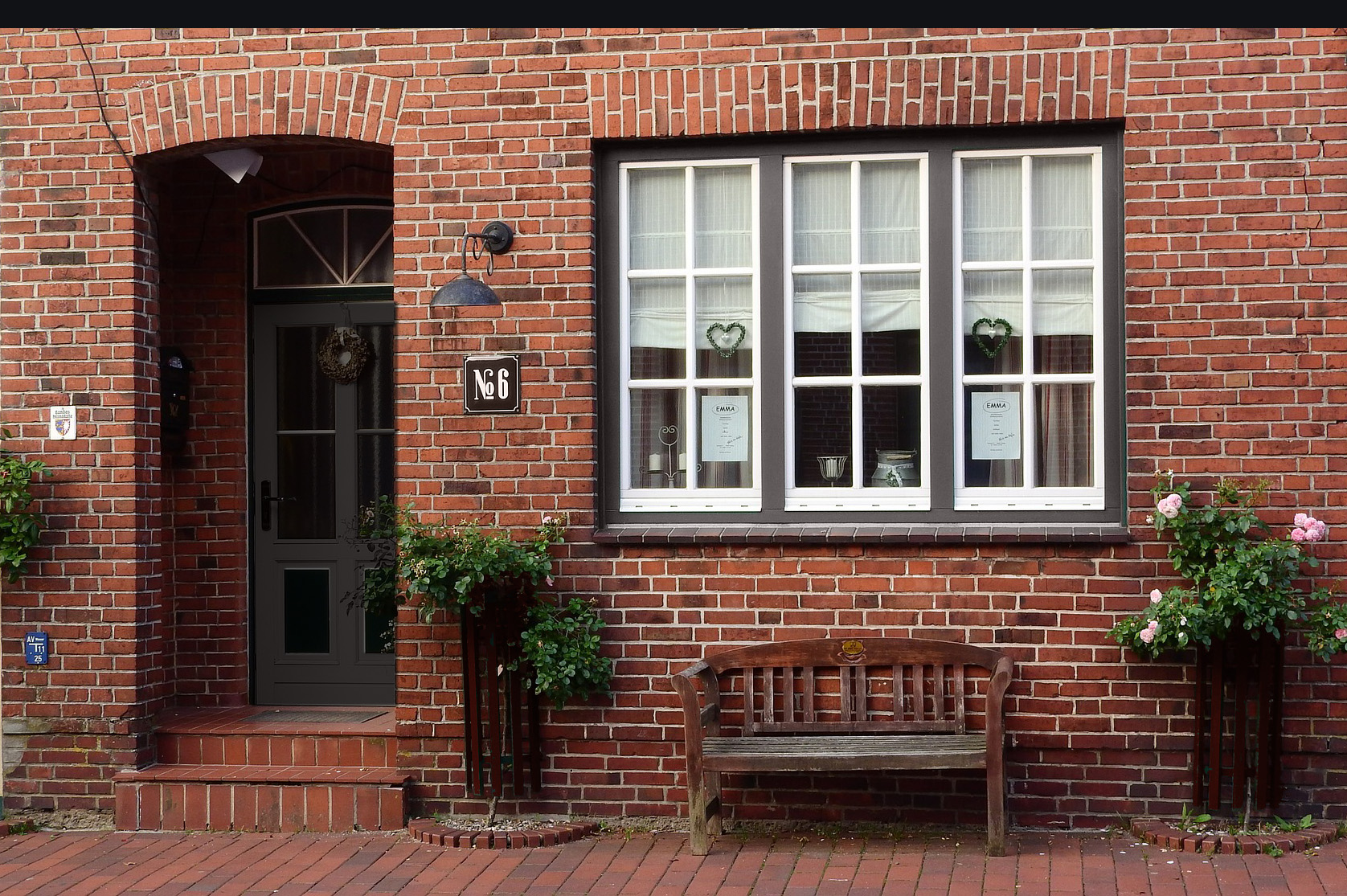
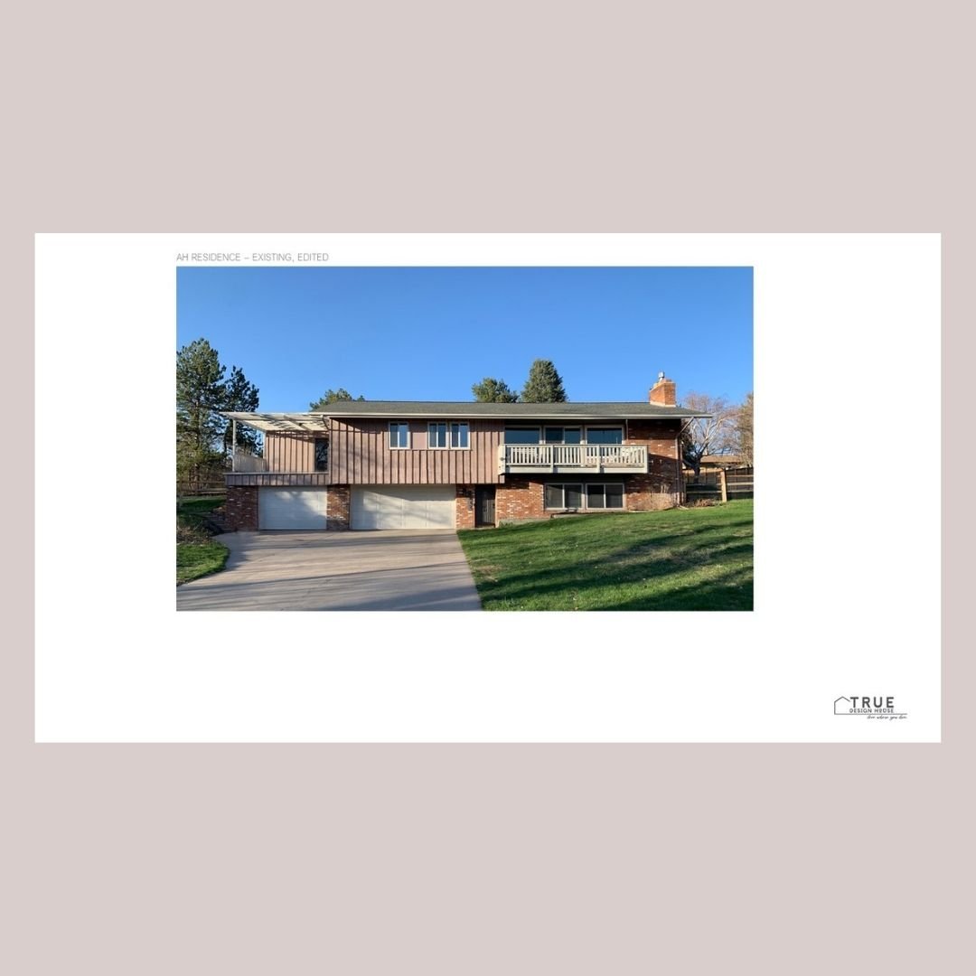
You also need to take your own brick’s tone into consideration before starting to look at other colors. There are likely variations in the colors on the entire area, as well as within each brick, but the overall brick can be red, coral, orange, pale peach, grey, or even purple toned.
Taking a digital picture and looking at it from far away can help figure this out if it’s not obvious right away. It can also help to have a photo when looking at colors.
Make sure to hold your samples up to your brick and take pictures of the whole grouping together to get a different perspective of how the colors will look together.


4. Architectural details
Consider the color of other architectural features. If they are permanent or you just don’t want to change them right now, they need to work well with the colors you are choosing for the facade. Look objectively at these areas: the roof, window trim & mullions, railings, stucco, vinyl siding, flower bed or planter building material.
Some of these things you might want to paint your main or secondary color, but some are just going to soldier on as-is, so you are going to have to work with them. You should always be able to work around things that can’t be changed and it’s sometimes surprising just how different things can look with the right paint colors around them... so, yes, there’s even aesthetic hope for that ugly roof you’re saving up to replace!

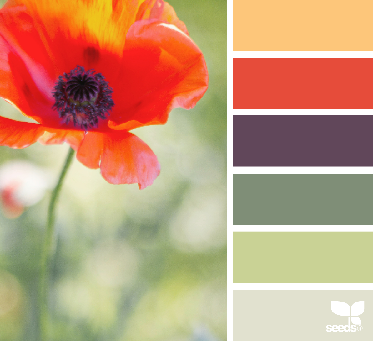
5. Landscape flow
Landscaping plays an important role as well. The colors of dominant shrubs, flowers, planters, and trees near the front of the house should also be looked at objectively.
If you have, especially, some mass plantings of bold colored flowers along the house front, you are going to want to ensure that either your paint enhances or harmonizes with these or that you are willing to transplant them elsewhere and replant something that will be gorgeous with the colors you have chosen.

I’ve created a little Brick & Paint package for you!
It includes:
a set of 14 Benjamin Moore paint colors that pair well with brick
a paint finder tool to screenshot and take to the paint store with you
a graphic summary of the tips outlined in this article.

Wait! Do you need more specific help?

Did you know you can hire me to help you choose your exterior paint colors and paint them right onto your house?


Looking to Pin for later?
Here you go!
