Make Your Oak Kitchen a Pinterest Stunner (in one weekend, without a major reno!)


When you are not ready, willing or able to do a complete renovation of your oak kitchen, the next best thing to do is transform it with pure style.  Yes, it can look absolutely amazing!  

If you can paint the walls, add a rug or two and accessorize until your heart explodes, your kitchen can go from 'Sad & Outdated' to 'Pinterest Stunner' in a weekend!


Level one:

Clear away all the clutter, banish accessories that are too beige or orange, and give yourself a clean slate.  

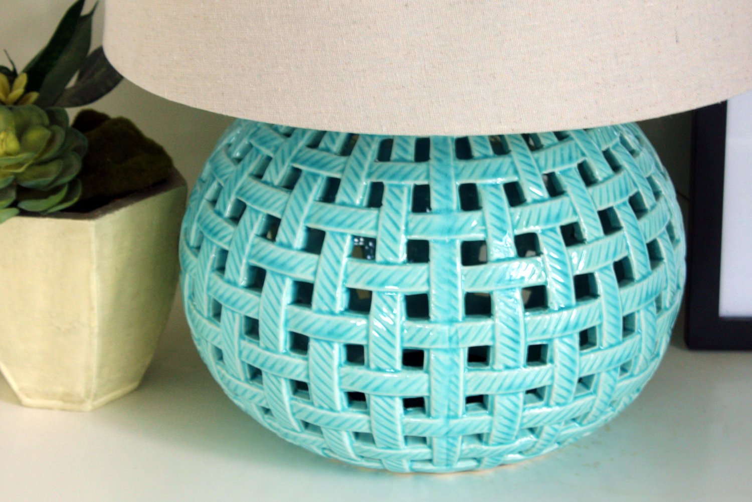
Choose one or two accent colors and choose accessories in several shades of that color.  In the example below, I went with a rich turquoise.  Blues and greens are great shades to work with honey oak as they both neutralize the orange tones in the wood really well.  At the most basic level, even just adding lots of eye-catching accessories will take the focus off of the oak.   

Rugs are a great investment in an oak kitchen, especially if the flooring is dated or isn’t the style you are aiming for.  


Level two: 

If you can paint the walls, it creates a gorgeous backdrop that downplays the oak and pulls everything together.  Please, please do this if you can!  Have time and inclination to paint baseboards and trim, maybe even the table or other furniture?  A creamy, neutral white will take things up a notch. 

Major bang for your buck: changing out the door and drawer hardware for a dark oil-rubbed bronze pull in a smooth look that is big enough to make a statement.  This is so easy to do and makes an incredible difference in the style of your kitchen.  

Also within the ‘DIY category’ of changes:  updating the lighting fixtures to something sleek and stylish, something without too much detail, is a huge style-maker as well.


Level three:

Ready for some minor renos that you can totally tackle yourself or have done in a few days by a pro?  

Replacing the counter top with a deep charcoal or graphite colored laminate and adding a gorgeous hexagon marble backsplash will transform your kitchen completely.  These items are a bit more of an investment, but not out of range if you are going to be making do with your oak kitchen for a few more years.  

The 'wow factor' of these larger ticket items make them well worth it.  They are absolute game changers for the feel of your kitchen as they take up so much visual real estate.


What not to do:

In general, I wouldn't waste your resources or precious renovation energy on replacing flooring or adding stone countertops to an oak kitchen.  

Why not?  Well, chances are when the time comes to replace or refinish the entire kitchen cabinetry, you are going to want to change those things at that time to either coordinate with the new cabinets or because styles have changed and they will need updating also.

You also don't like want to get 'out of your league' when it comes to return on investment with the kitchen cabinets as-is.  If you sell your home before renovating any further, sinking big bucks into major items in an outdated kitchen is not always a wise investment.


Getting started:

I had a lot of fun putting together a look that you can actually shop!


This post may contain affiliate links. For more information please click on the 'policies' tab at the bottom of this page.


Looking for the summer 2021 update?


Need a bit more in-depth help updating your oak kitchen?


Looking to Pin for later?

Here you go!

true design house - oak - 16 - pinterest - 4b.jpg


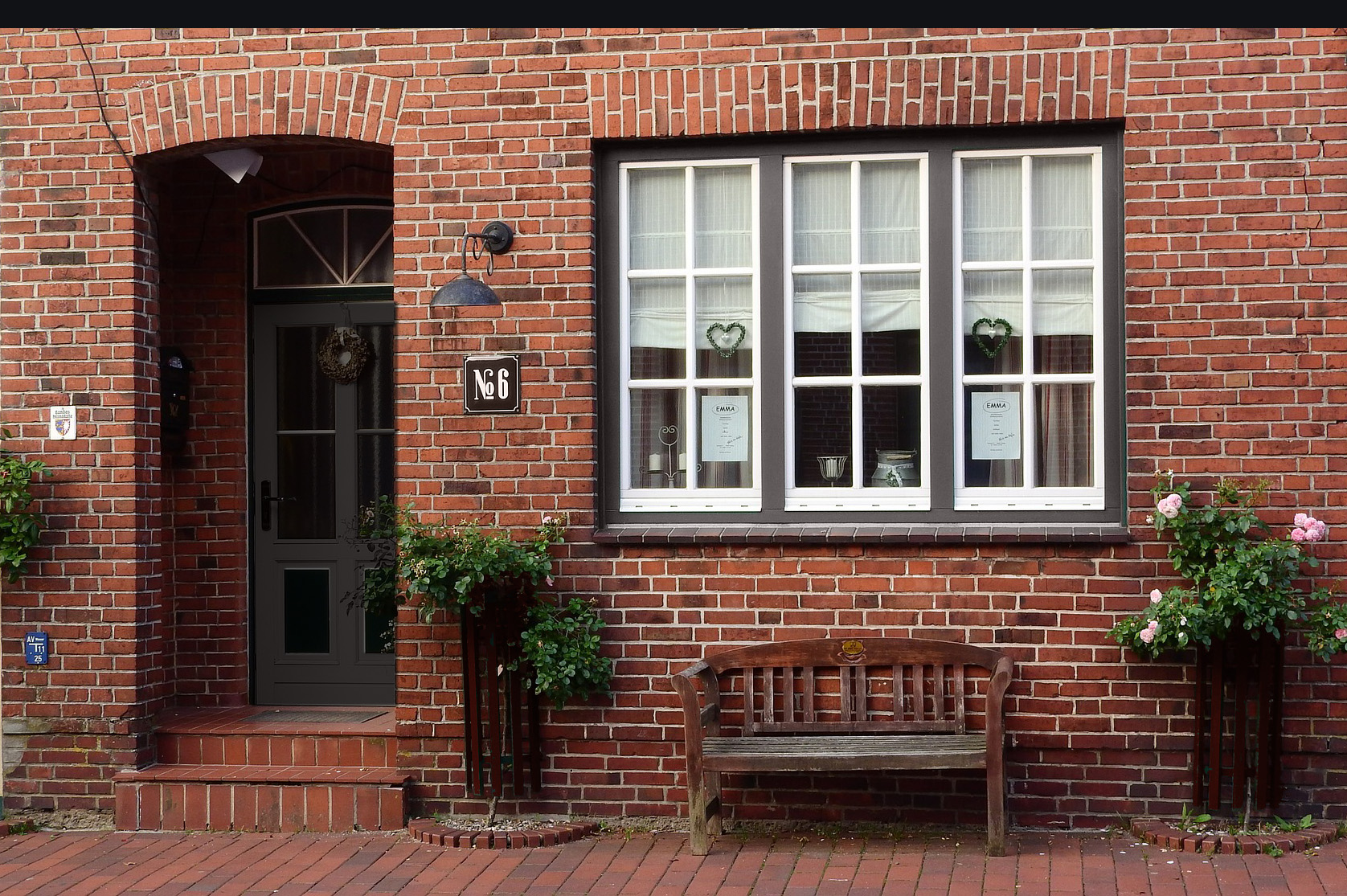
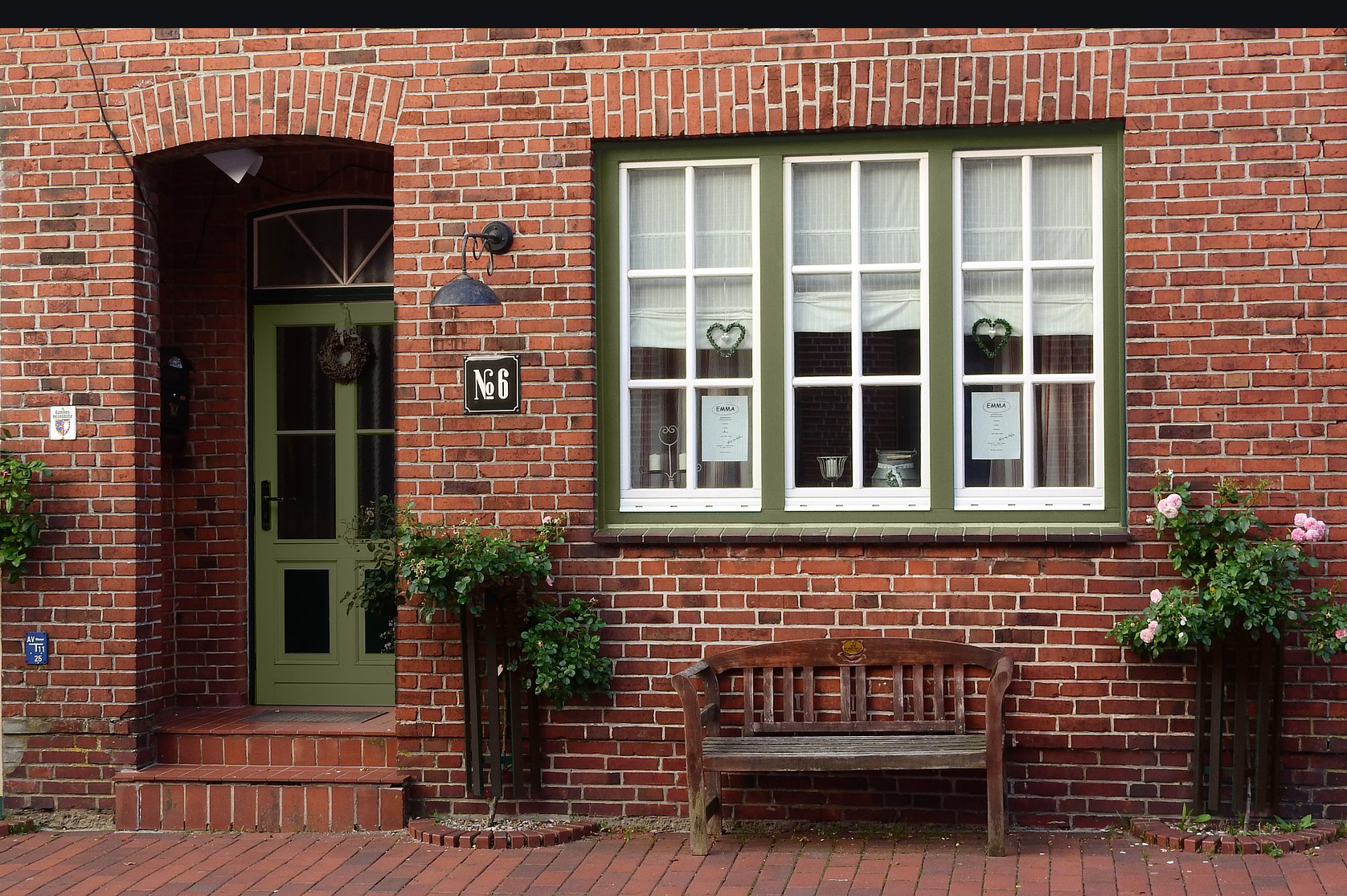
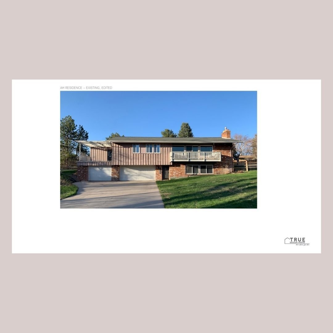
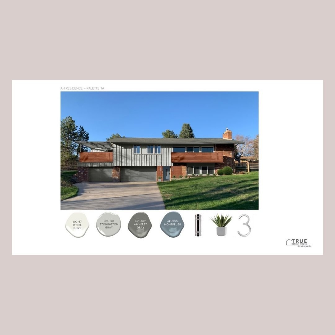
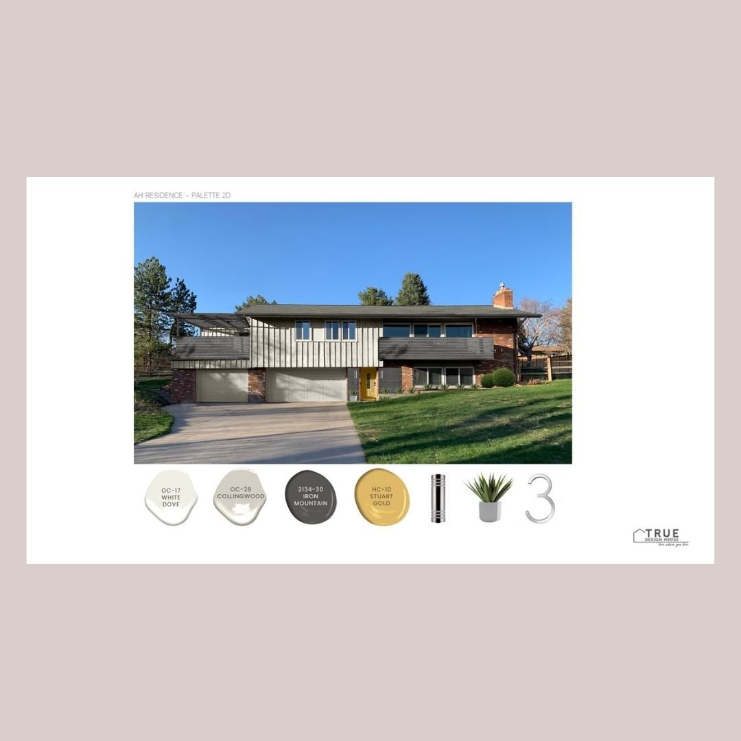
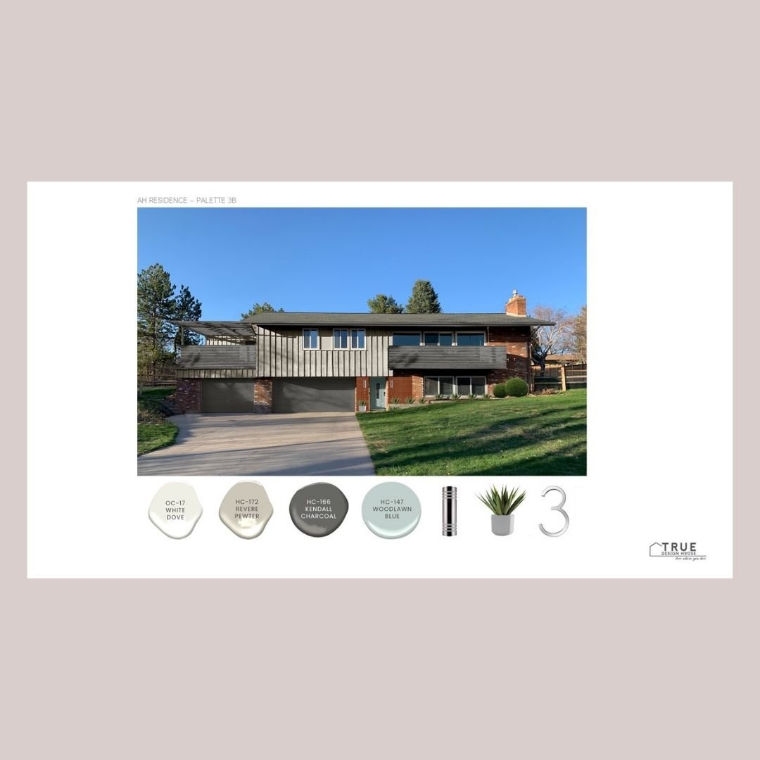
Stunning Paint Colors That Will Make Your Brick Exterior Beautiful


Need some design inspiration for your brick exterior? Looking for the best paint colors to go with brick?

Sounds like you’re ready to breathe some new life into the outside of your brick home - good news, you’re in the right place for some very specific advice & paint suggestions.

There are a few basic design theories and practices that take a brick exterior from tired to knockout and I’m going to walk you through them and, don’t worry, I also have a downloadable cheat sheet with a curated collection of 14 Benjamin Moore paint colors that will make your brick exterior beautiful. 

Let’s get started!


1. The 3 Color Rule

A general design rule of thumb is that exteriors look best with a combination of 3 colors. 

This gives a good balance between the main overall background color and some details that can be a bit bolder without overwhelming the house.  For most people, the goal is for it to be cohesive and gorgeous with just a bit of ‘oh, that looks so good!’ wow factor.


Main Color

The main color is what would normally be the central siding or stucco color.  This is sometimes called a field color.  This would be a nice, rich tone that you can live with for a long time or that is neutral enough for resale down the road. 

If this is the brick portion of your house, then this is taken care of!

This color tends to be the biggest financial investment as well, so it makes good sense to go with something that can serve as a nice background for years to come.   

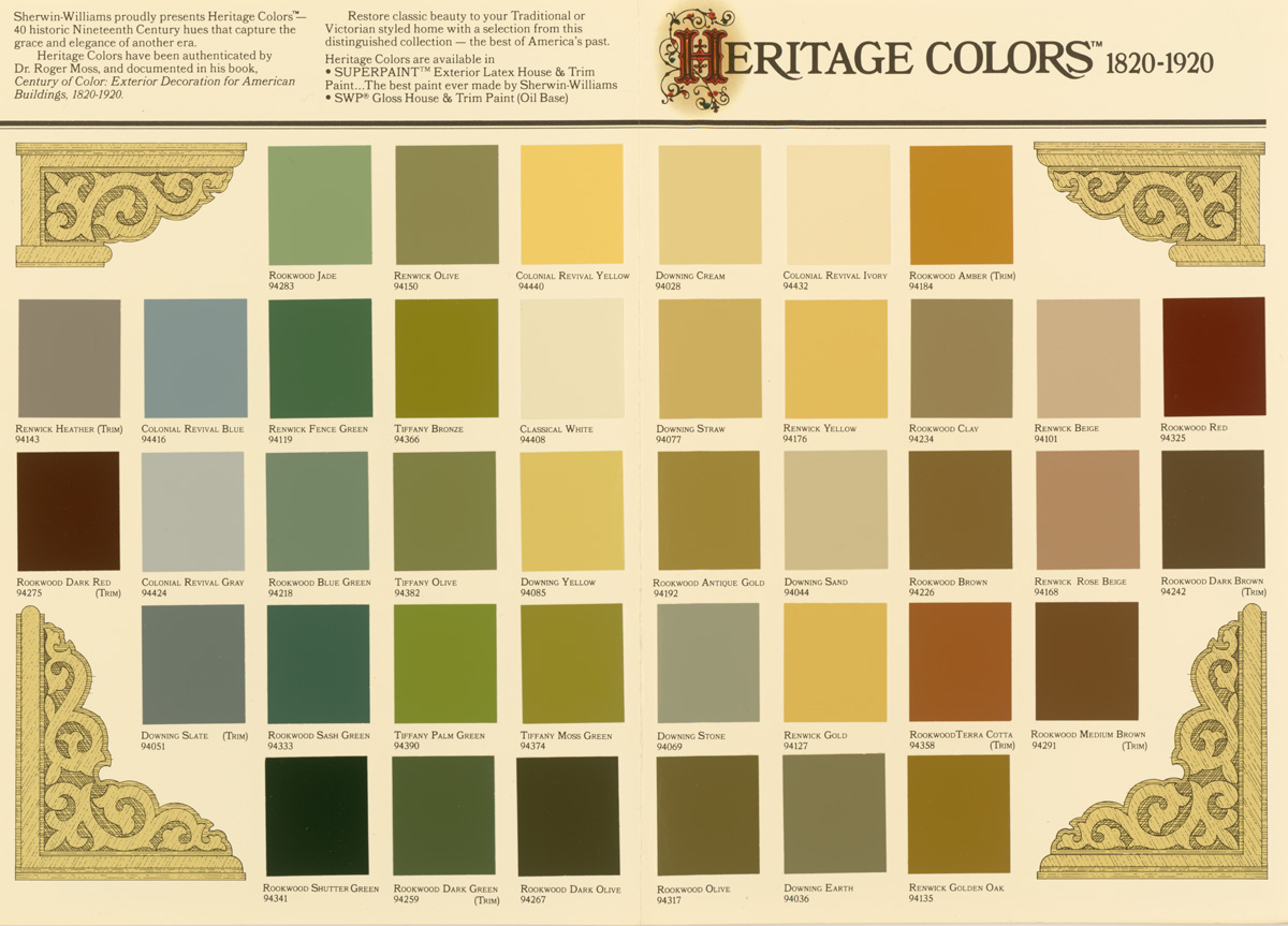
You can dramatically change the look of a good neutral main color by changing up the ‘quick and easy’ accent color in places like the front door or shutters, so choose wisely here.  This is the time to consider the architecture of your home and of your neighborhood and to take a good look at heritage colors.  These tend to be mature colors that have stood the test of time and are not likely to go out of fashion anytime soon.    

You also want to think about whether you want to have your home color be cohesive with the rest of the houses in your neighborhood (mostly, the answer is yes!)  You don’t want to be ‘that family’, right?   Unless you do want to be, then go for it – whatever makes you happy!

Secondary Color (Or Secondary Grouping)

The secondary color is often seen in stonework on the front facade, like field stone, slate or possibly this is the brick we are talking about today.   

The secondary color might also be the trim of the house – fascia, gutters, window trim, railings, etc.  If there is not a lot of stone, I tend to let that sit as a ‘near-neutral’, a ‘secondary-secondary’ color because you kind of do need and want a separate trim color in a lot of cases. 

Some houses will use a paint color for the trim that matches the stone and that can work as a ‘secondary team’ also. 

This grouping of secondary colors should not take up a huge amount of the area of the house facade because you don’t want your stone and trim to compete with the main color of the house but you want to have more of this neutral color than your accent color. 

This color is great to break up the facade of the house visually, highlight architecture (like windows, gables, flower planters and porches), and give some depth or balance to what can sometimes otherwise be a large, flat rectangle.  You wants lots of contrast between the secondary and main colors in most cases.

The Accent Color

A bright, bold or eye-catching color might be perfect for the front door but would be a bit crazy on the entire house, which is where that third color, the accent color, comes in. 

This is the place to go a bit bolder and choose something that will make a statement if you like.  It can also be the place to, finally, show some personality in the exterior colors or to just use color to evoke some feeling. 

The accent color doesn’t need to be a bright red door that announces your style to everyone who passes by, it can also be a deep charcoal paint on the shutters or a soft butter yellow on the porch floor.  This is the place to create some style.


 2. Perfect Ratio

There is a design theory of the perfect ratio for these 3 colors:  60:30:10.  This provides the main color, a secondary color and an accent color.  Use this ratio, it is your friend!

To use this information with a brick exterior, you need to use the brick as one of your three colors.  Depending on the amount of brick, this will likely be the main or secondary color.


3. Your brick tone

You also need to take your own brick’s tone into consideration before starting to look at other colors.  There are likely variations in the colors on the entire area, as well as within each brick, but the overall brick can be red, coral, orange, pale peach, grey, or even purple toned. 

Taking a digital picture and looking at it from far away can help figure this out if it’s not obvious right away.  It can also help to have a photo when looking at colors. 

Make sure to hold your samples up to your brick and take pictures of the whole grouping together to get a different perspective of how the colors will look together.


 4. Architectural details

Consider the color of other architectural features.  If they are permanent or you just don’t want to change them right now, they need to work well with the colors you are choosing for the facade.  Look objectively at these areas:  the roof, window trim & mullions, railings, stucco, vinyl siding, flower bed or planter building material. 

Some of these things you might want to paint your main or secondary color, but some are just going to soldier on as-is, so you are going to have to work with them.  You should always be able to work around things that can’t be changed and it’s sometimes surprising just how different things can look with the right paint colors around them... so, yes, there’s even aesthetic hope for that ugly roof you’re saving up to replace!


 5. Landscape flow

Landscaping plays an important role as well.  The colors of dominant shrubs, flowers, planters, and trees near the front of the house should also be looked at objectively. 

If you have, especially, some mass plantings of bold colored flowers along the house front, you are going to want to ensure that either your paint enhances or harmonizes with these or that you are willing to transplant them elsewhere and replant something that will be gorgeous with the colors you have chosen.


I’ve created a little Brick & Paint package for you!

It includes:

  • a set of 14 Benjamin Moore paint colors that pair well with brick

  • a paint finder tool to screenshot and take to the paint store with you

  • a graphic summary of the tips outlined in this article. 

 
True Design House - brick paint mini houses 2.png
 

Wait! Do you need more specific help?

Slide2 - sm.png

Did you know you can hire me to help you choose your exterior paint colors and paint them right onto your house?

2.png
8.png
5.png


Looking to Pin for later?

Here you go!

true design house - brick - 30 - pinterest - 4.png


Grey Matter: How to Choose the Perfect Grey Paint


Neutrals are the quiet backdrop to a vibrant life and over the last few years, grey has been launched to the top of the style list.  Beige has been steadily nudged off the palettes of interior designers and what a rich transformation it has been!

Grey was once thought to be harsh, dreary and often ugly, but now the paint world has been flooded with a gorgeous, rich grey palette with so many great choices.  Paint manufacturers are really bringing their A-game to the park when it comes to greys and I couldn’t be happier about that – there are some amazing grey tones out there right now!

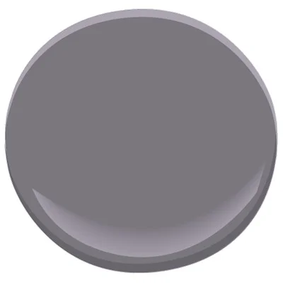
Grey has steadily developed a reputation for being sleek, stylish and sophisticated and it is well deserved.   With undertones of brown, blue, purple or green there is an outstanding amount of gorgeous paint colors to sample and coordinate with.   I’m pretty convinced there is a perfect shade of grey for every room.


Pale greys in any undertone

These colors are a sleek, updated alternative to white or beige.  They make a room feel airy and open without being stark.


Light greys with a blue undertone

These paints can look like they are almost a softly reflective silver in a room flooded with natural light.  Very bright, fresh and clean feeling.


Mid-tone greys with a warm undertone

Choosing a grey with a brown undertone can create a stylish, mature warm space.  The warmer shades of grey maintain their sleek style without being at all cold or harsh.  These tones are my first pick for northern hemisphere homes where the natural light appears blue when bouncing off snow.  During all those months of a snow blanketed world, we need a little warmth inside!  Be careful not to steer too far into the brown undertones if you are wanting a grey rather than a taupe.


Mid-tone greys with a purple undertone

This tends to be a softer, more feminine color and often makes a space feel more casual and warm.  Greys with purple undertones tend to be much less formal than a classic stark grey with black undertones.  This color can bring some maturity to a space without being harsh.


Rich greys with a blue undertone

These greys are very bold and cool and lean the most toward classic grey with black undertones.  This color is perfect for a heavy, masculine, calm space or a room that needs to be visually cooled down.  It can provide much needed balance from things like lots of south-facing windows or warm finishes (wood flooring or warm-colored stone).  It can balance and ground things really nicely.


Dark toned charcoal greys

This is a bold range of paint colors but these gorgeous, rich colors are so rewarding.  A deep, rich color on the walls with pure neutral undertones can be striking, sexy and enveloping.  You will feel grounded and calm in a space painted the right dark shade of charcoal grey.  I am a huge fan of this color range for bedrooms – these colors tend to be just right for a restful sleep and a quiet mind at bedtime.


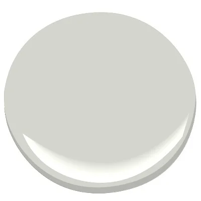
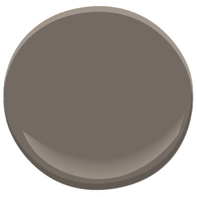
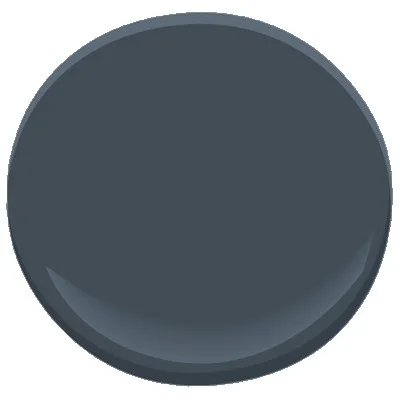
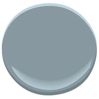
Here are a few fabulous greys I’ve been loving lately!


Ready to love where you live?

Join 25 000 others for instant access to my library of free, practical, and down-to-earth interior design resources!

 Looking to Pin for later?

Here you go!


true design house - grey paint - 28 - pinterest - 4.png

Plunge In: My Top 5 Paint Colors for Deep, Moody Walls


Color is a metamorphosis of a space and it is absolutely a complete game changer.  There is nothing you can do to your space that will have more impact than simply painting it.

A great color can influence a person at the deepest level.  It can be calming, inspiring, energizing, comforting, revitalizing.  There are so many reasons to just go for it – plus, it’s the best use of money you will spend on your room transformation (and it doesn’t take much money, either!)

A rich color just turns up the volume on all of the great things in a space: it makes a statement.  A soft color whispers , which is just fine in most spaces but sometimes you need a little bit of energy.   Plus, a pale, non-committal color can be a little... boring.  Even an ugly, sad beige says something to you daily, whether you like it or not (and, sadly, what it usually says is something along the lines of a tired, drawn out whine... and you deserve better than that.) 

Going dark and turning up the intensity is a bold move so you want to get it right.  You need to avoid just being loud and obnoxious - you want the right amount of pigment with the right amount of depth.  Without some maturity, your colors sway drunkenly into ‘fast food joint’ or ‘teen girl bedroom’ pretty easily.  These suggestions will help you to stay on the luxurious, amazing side of bold color.

If you have the courage and are ready to plunge into some real color, here are my top picks for bold, inspiring paint colors that say something great. Scroll to the bottom for a list you can save & print.

Check out my top picks for deep, moody paint colors right now!


Ready to love where you live?

Join 25 000 others for instant access to my library of free, practical, and down-to-earth interior design resources!


Looking to Pin for Later?

Here you go!

true design house - moody paint - 27 - pinterest - 4.png

5 Soul-Focused Tips for Designing a Feel-Good Room


A personal style is like handwriting – it happens as the by-product of our own way of seeing things, enriched by the experiences of everything around us. - Massimo Vignelli


Designing a space that is ‘just right’ means pulling together things that make you feel good and that remind you of warm memories.  You will be at your most comfortable when you are surrounded with things that make you happy and remind you just why it’s good to be you.  Here are 5 soul-focused tips for doing just that.


1.       Clear the clutter

Get rid of stagnant energy by clearing out clutter.  These piles and nests of stuff tend to harbor bad feelings because they are normally things you need to deal with, are unfinished or regret buying or owning in the first place.  Quickly evaluate what you really need to keep (then put it away properly or deal with it right away) and get rid of everything that no longer serves you.


2.       Turn up the volume on some great color

The psychology of color is vital to creating a happy space.  Yes, there are studies and charts to help you find a color that might give the mood you are looking for, but if that’s not your thing, take a look at your closet or the rest of your house.  What colors are you drawn to?  What makes you feel good?  It’s also important to think of the energy you want your room to have – brighter colors tend to be ‘louder’ and be more energetic.  Muted tones tend to be more soft and restful.  Dark, bold colors tend to have a solid, heavy feeling.  Adding color can be as subtle as small accessories or a throw, or as bold as painting the entire room.


3.       Add a few memories

Having little touches of things that warm your heart is the best way to make a connection with your space.  Things like pictures of tender moments with your children and happy photos from around your home are easy fits here.  Don’t overlook more abstract mementos, though.  In my house I have on display a rock collection from summer walks with my kids, a few feathers in a vase brought to me by my son, and a watch that belonged to my husband’s grandfather.  All of these things make me smile when I look at them.


4.       Nod to nature

A connection to nature will bring life to the space.  Consider plants, fresh flowers, rocks, rough wood, water features.  Don’t overlook big, open windows (keep those blinds open and hang your curtains outside the frame), especially if you have a view of trees or a garden.  If plants aren’t possible or just aren’t your thing, there is nothing wrong with a good quality fake, or consider the other non-living alternatives.


5.        Let all that isn’t you fall away.

Evaluate everything in your space.  Get rid of things that just aren’t you - you know you have at least a few things that just bother you for whatever reason – au revoir!

(If you like this image, you are welcome to save it and use it as a phone wallpaper!)


Ready to love where you live?

Join 25 000 others for instant access to my library of free, practical, and down-to-earth interior design resources!

Looking to Pin for later?

Here you go!

true design house - soul focused design - 26 - pinterest - 5.png